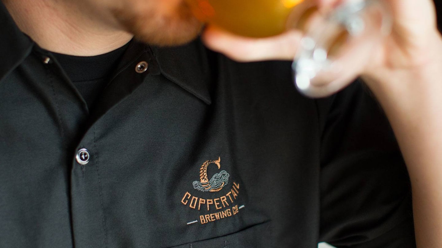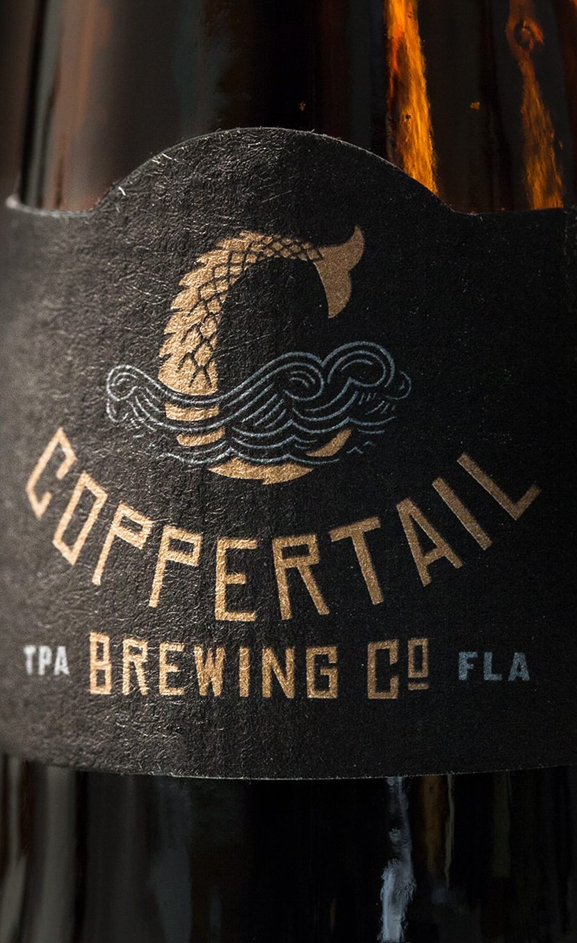
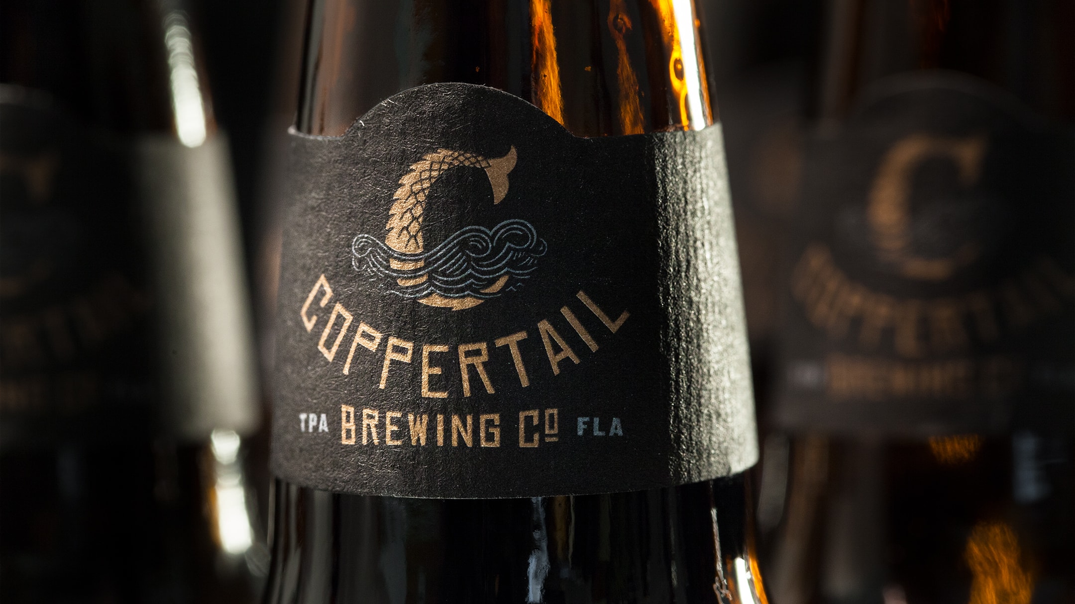
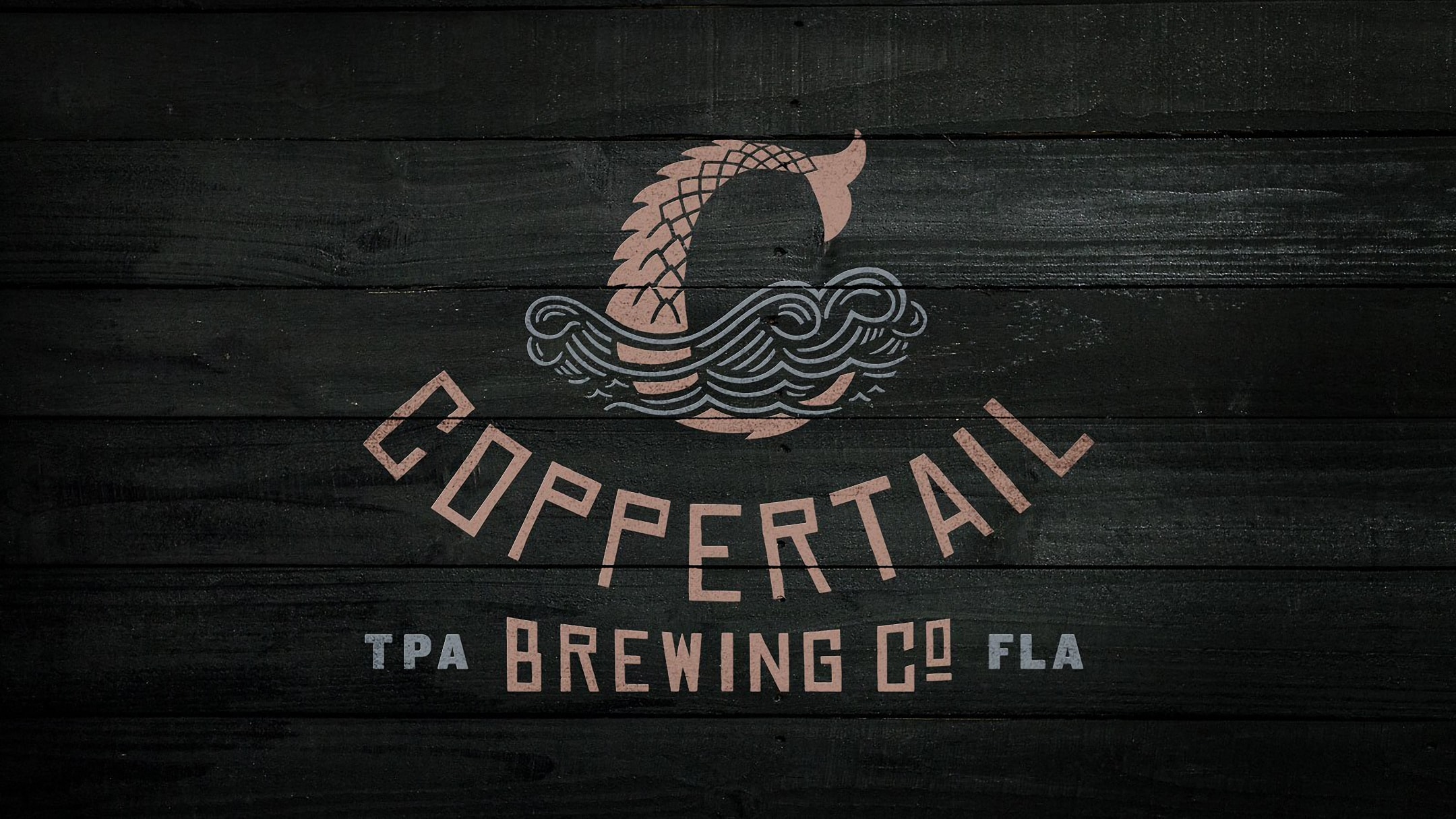
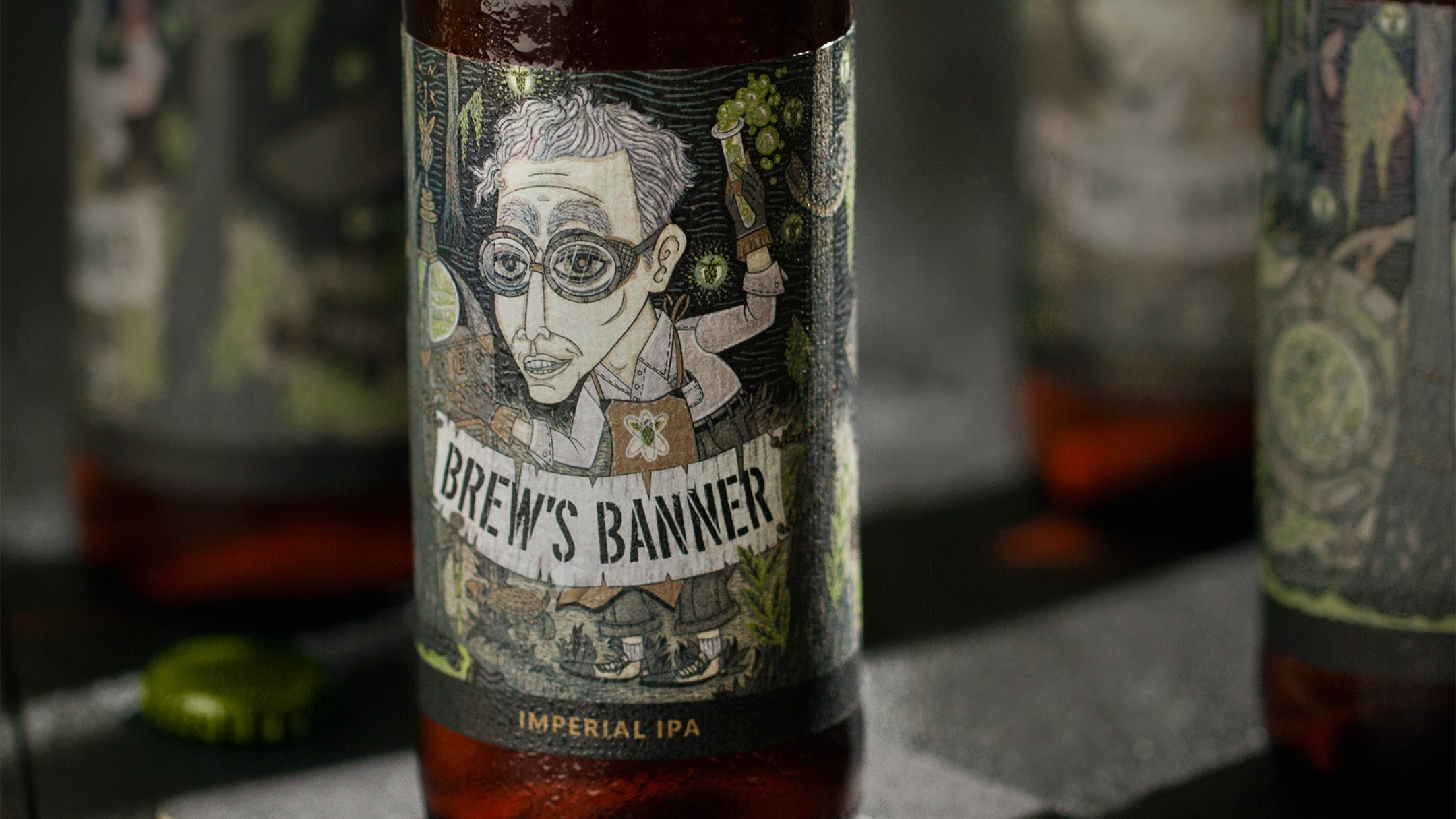
Florida’s craft beer scene was on the rise. People craved more individuality and when a home-brewing former lawyer asked us to help him give it to them, we raised a glass to the task. With just a character and a name from the imagination of a 5-year old, we built a beer branding and packaging design system that stands up to mega-breweries by being not just a great beer, but one of legends.
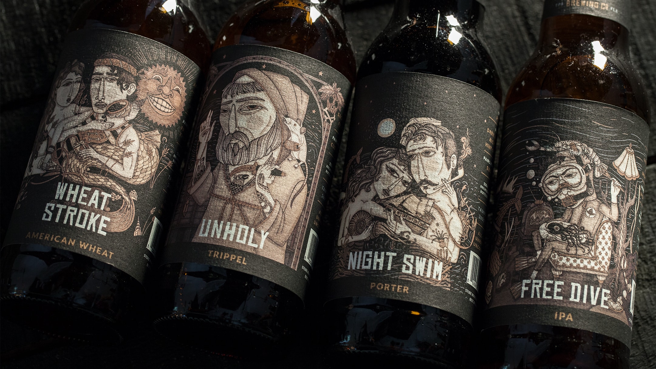
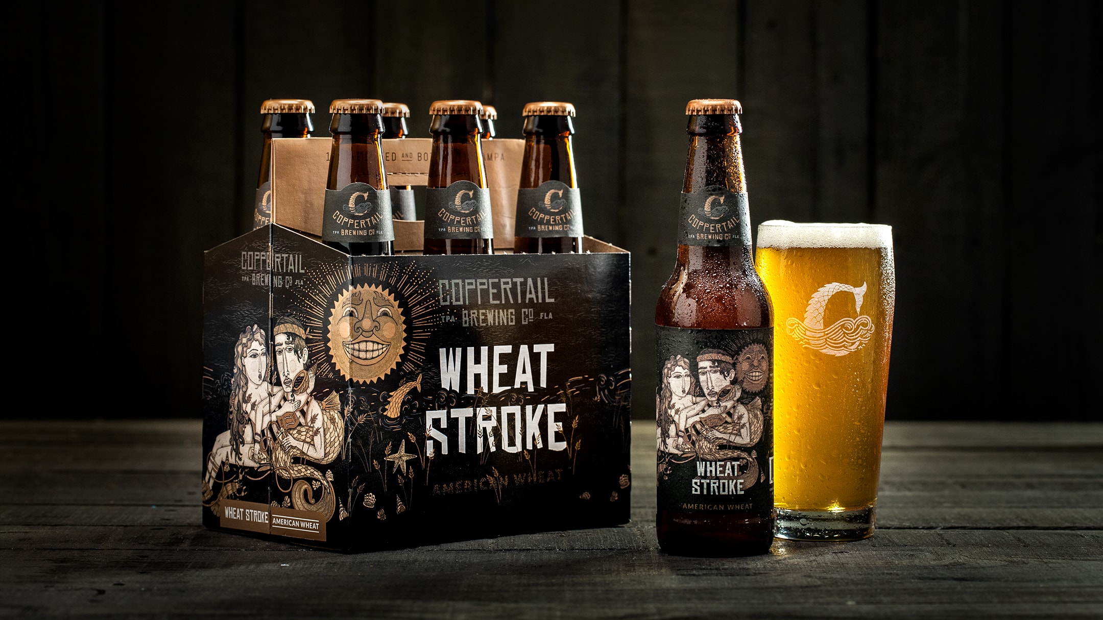
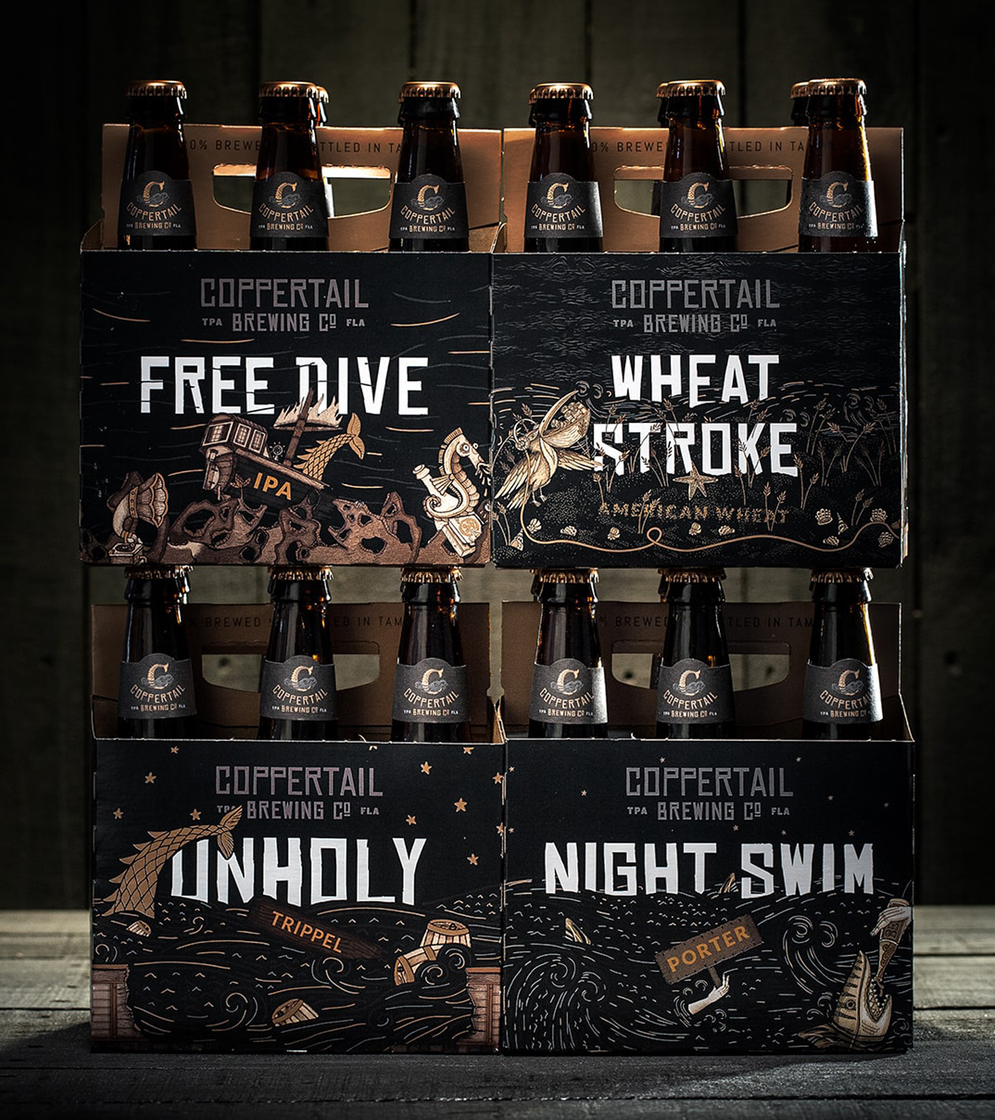
In our initial competitive research, we were met with beer aisles stocked with bottle after bottle of colorful labels. Beyond creating a distinctive personality, we knew color, or an absence of, would play a role in branding and packaging design.
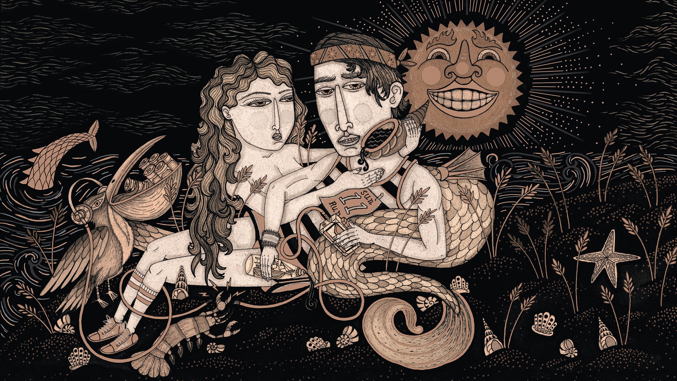
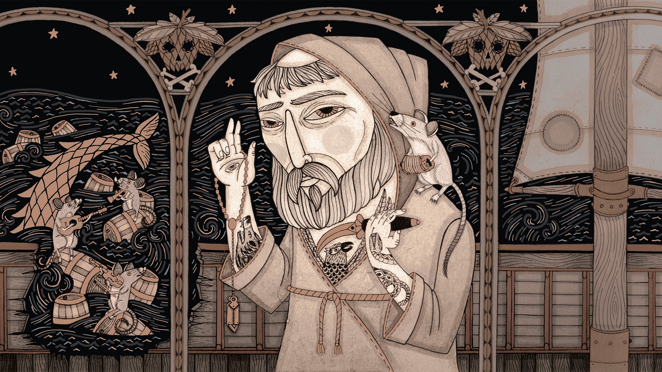
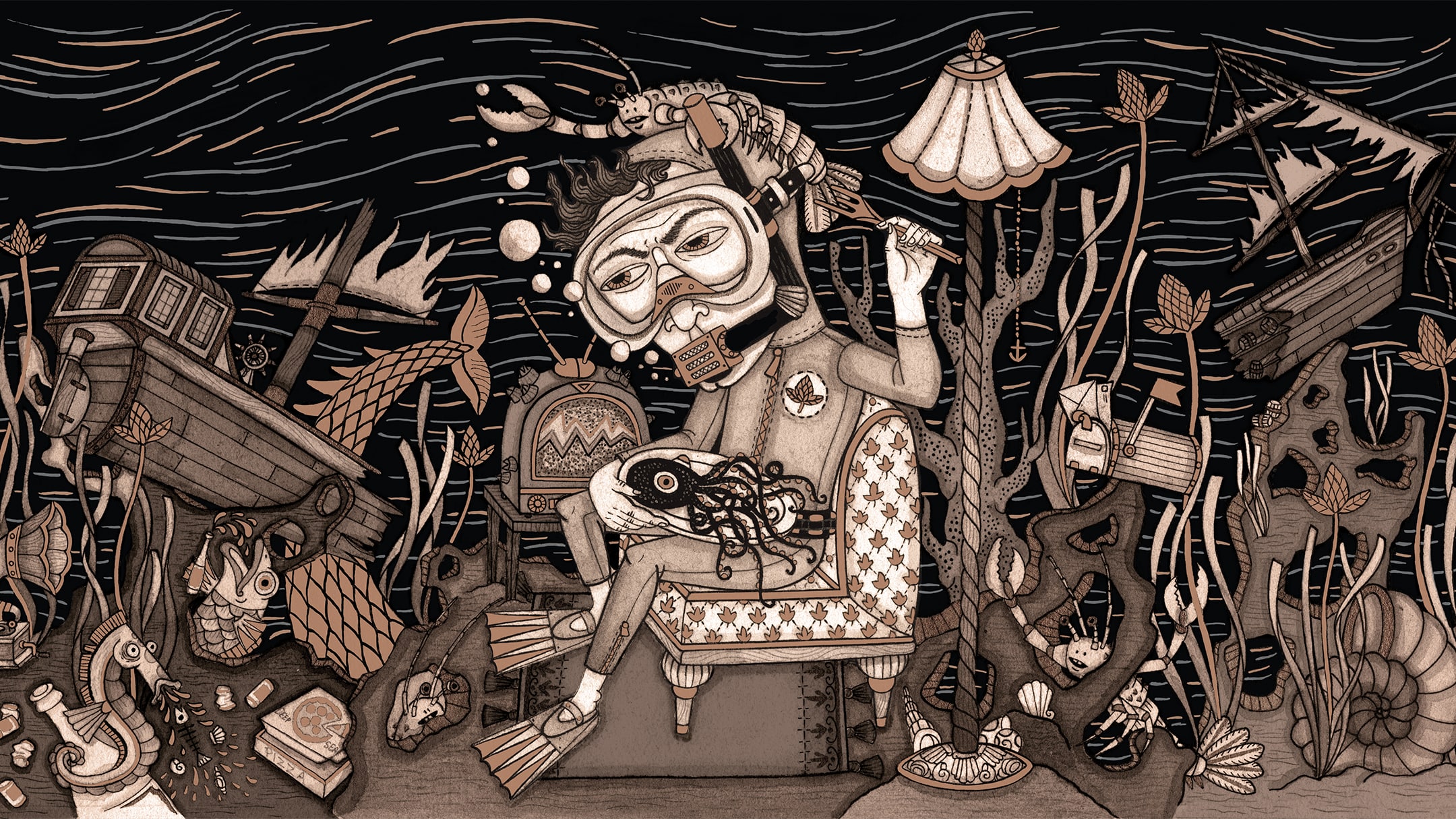
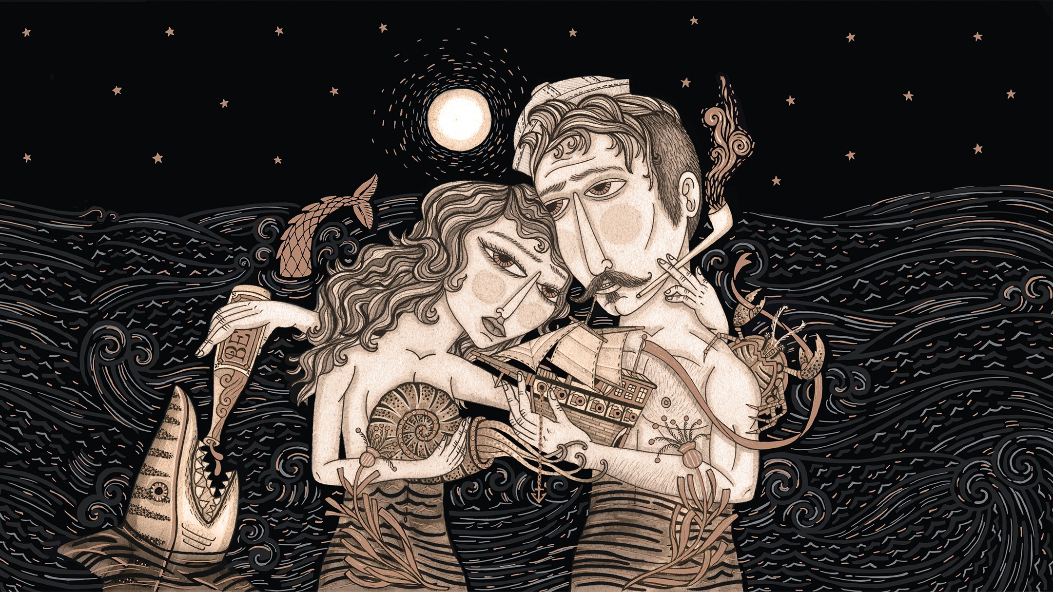
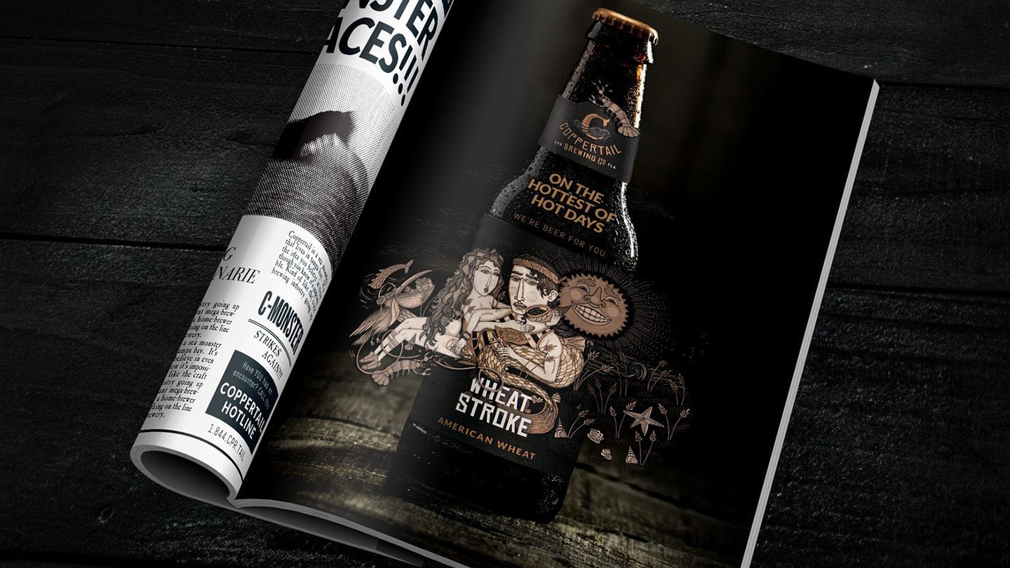
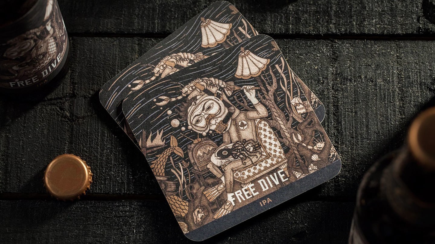
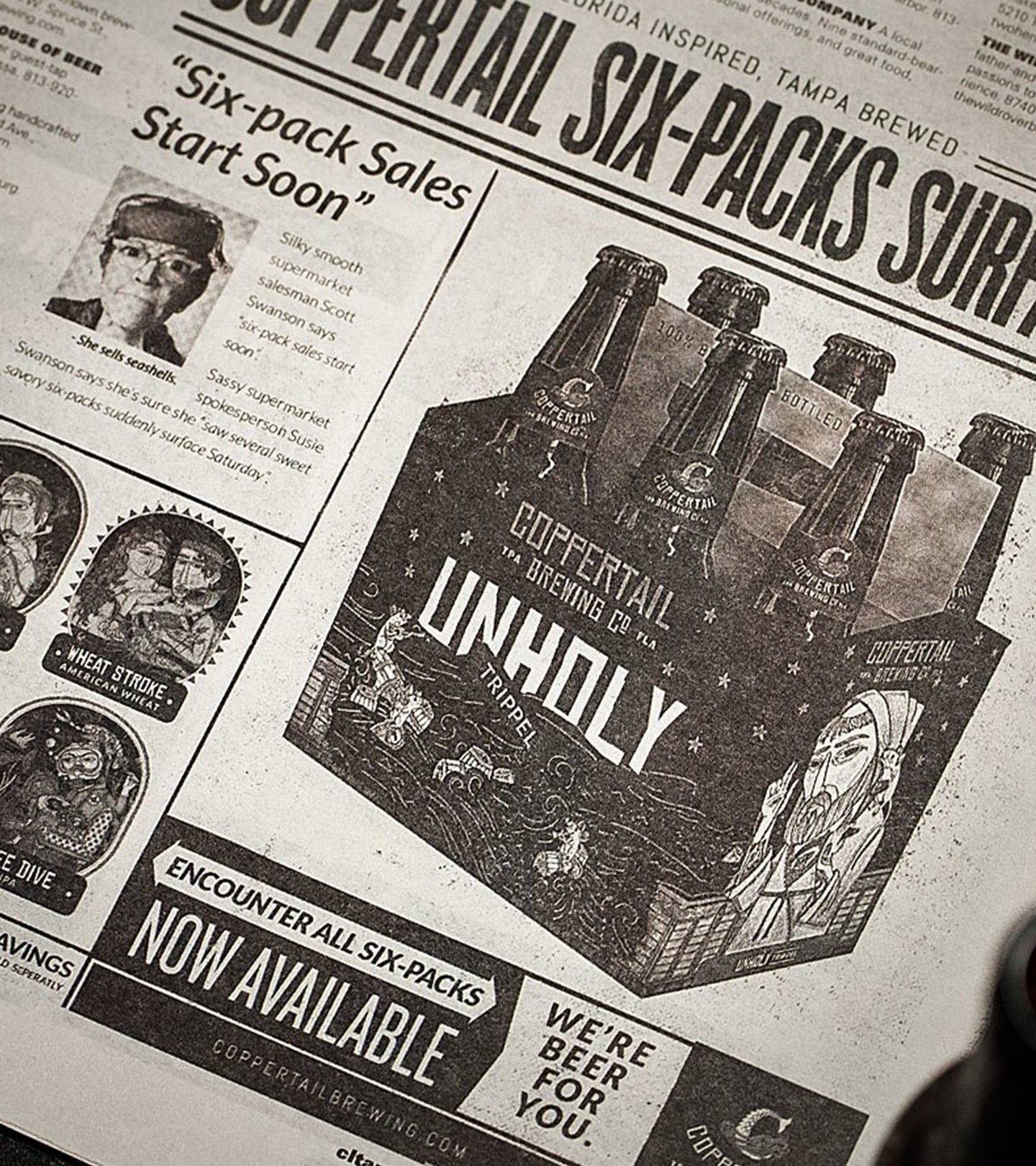
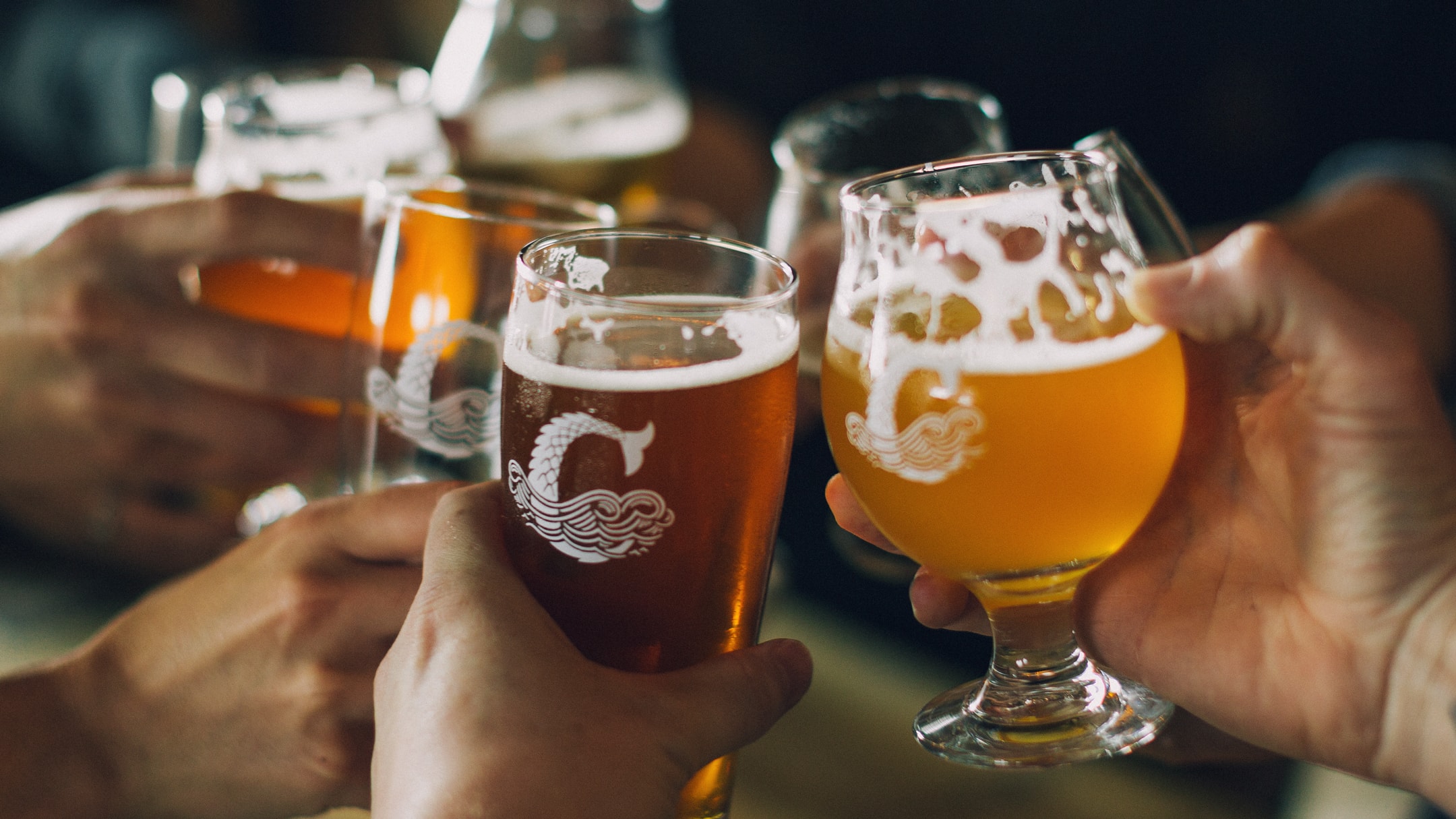
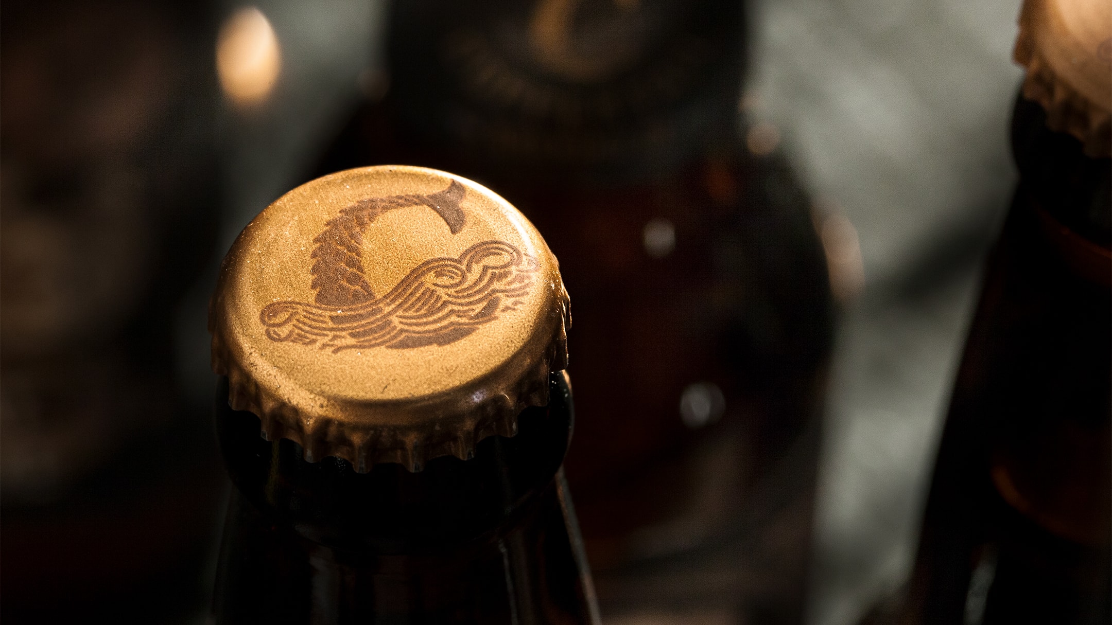
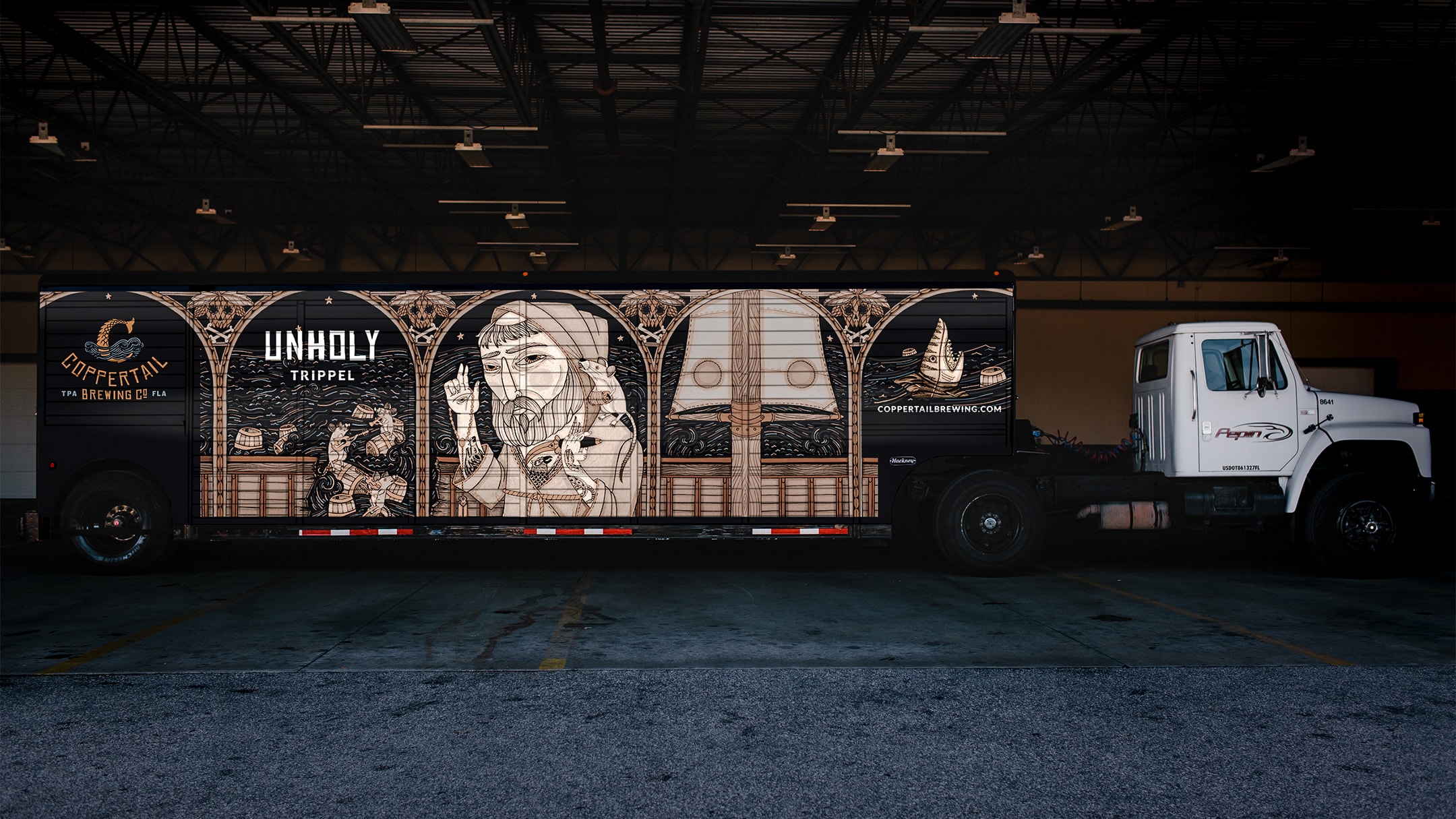
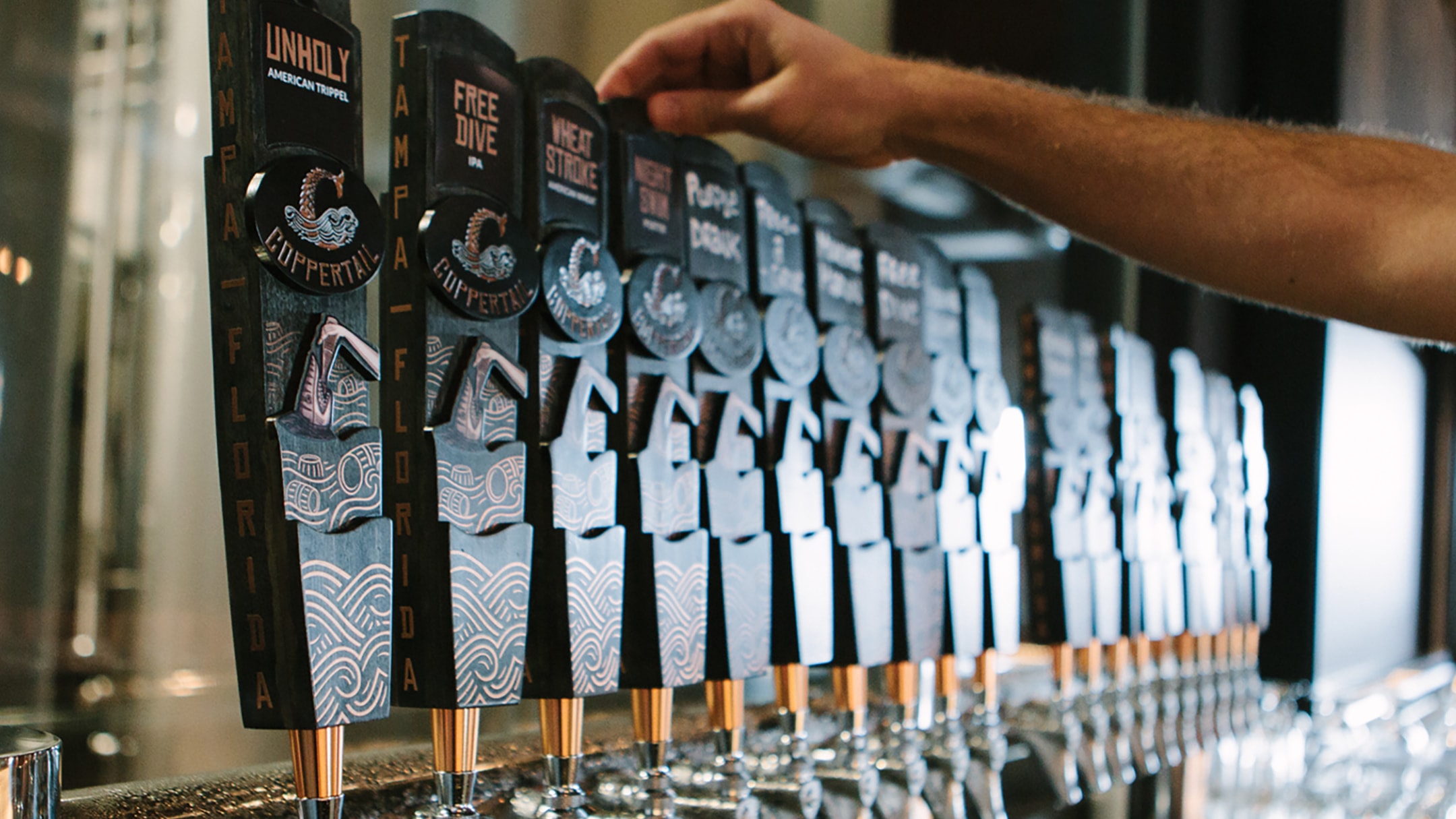
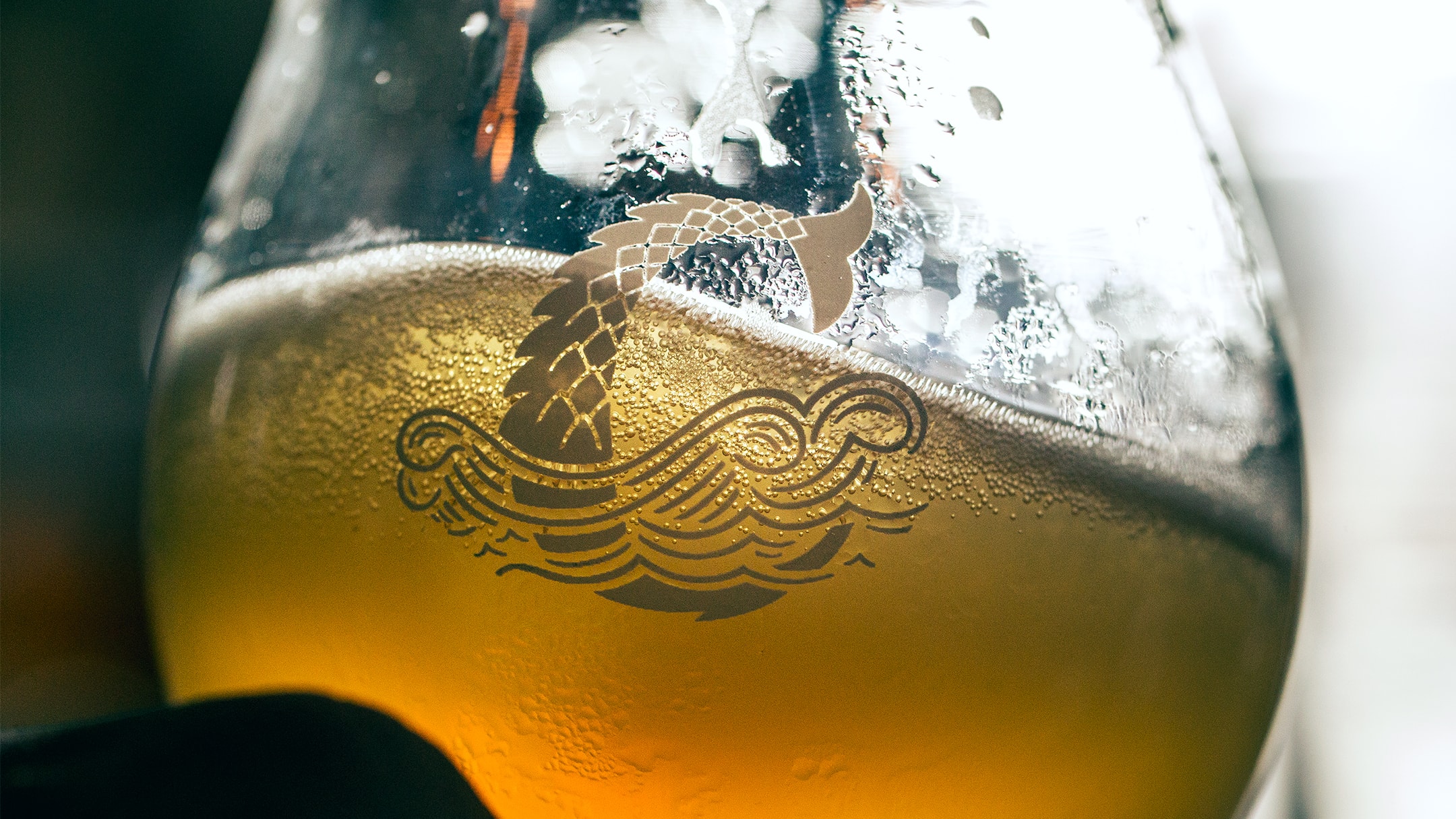
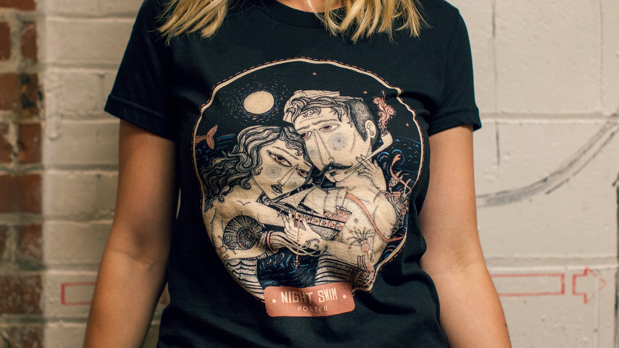
We created a dark yet whimsical world based on encounters with the legendary C-Monster that would be used on everything from labels to packaging and before we even launched, people were requesting the product.


- TheDieline.com
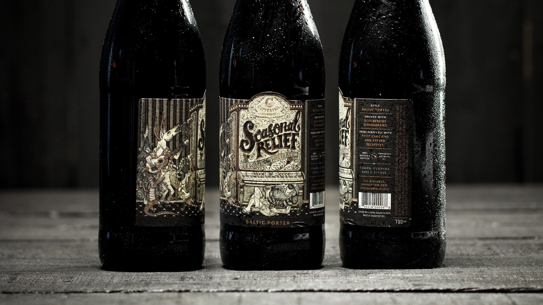
To this day, we outperform competition on Publix shelves on average of 10-20% and continue to work with the founders and artist to turn speciality batches into more Coppertail sightings.