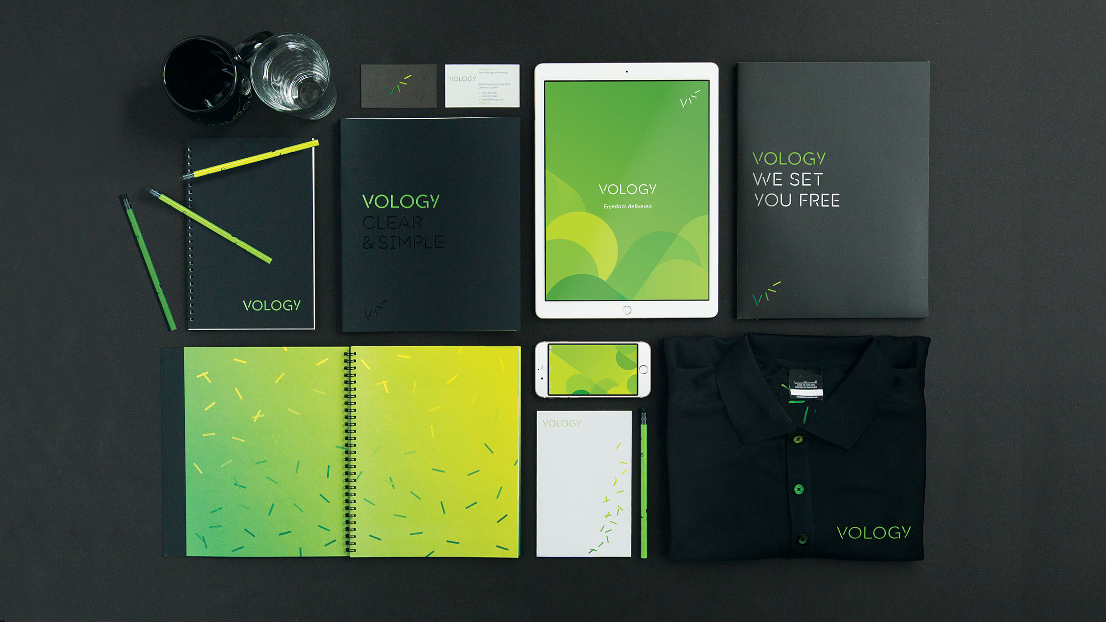
Few things are worse than being misunderstood and Vology, an IT product reseller turned IT services manager, was feeling the pain. Known as “used Cisco guys,” they came to us to help both employees and customers shift to a new, simpler way of managing technology. By updating the business model and identity to stand out from other IT marketing, we helped others see how Vology sets you free from complicated.
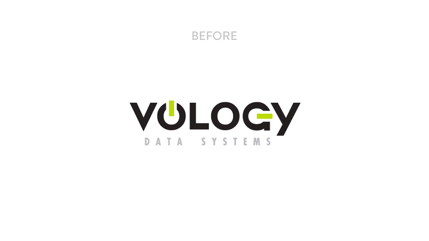
Free from buzzwords and acronyms with a renewed focus on responding to clients’ needs with solutions not products, Vology’s service lines were completely overhauled. This meant the old logo, with its power button letter rooting it solely in a world of products, needed to go.
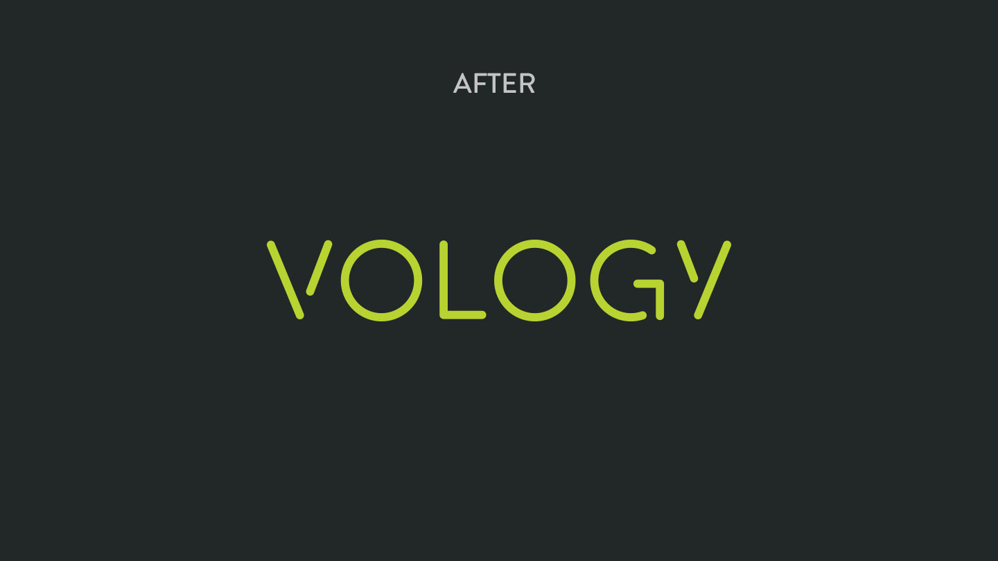
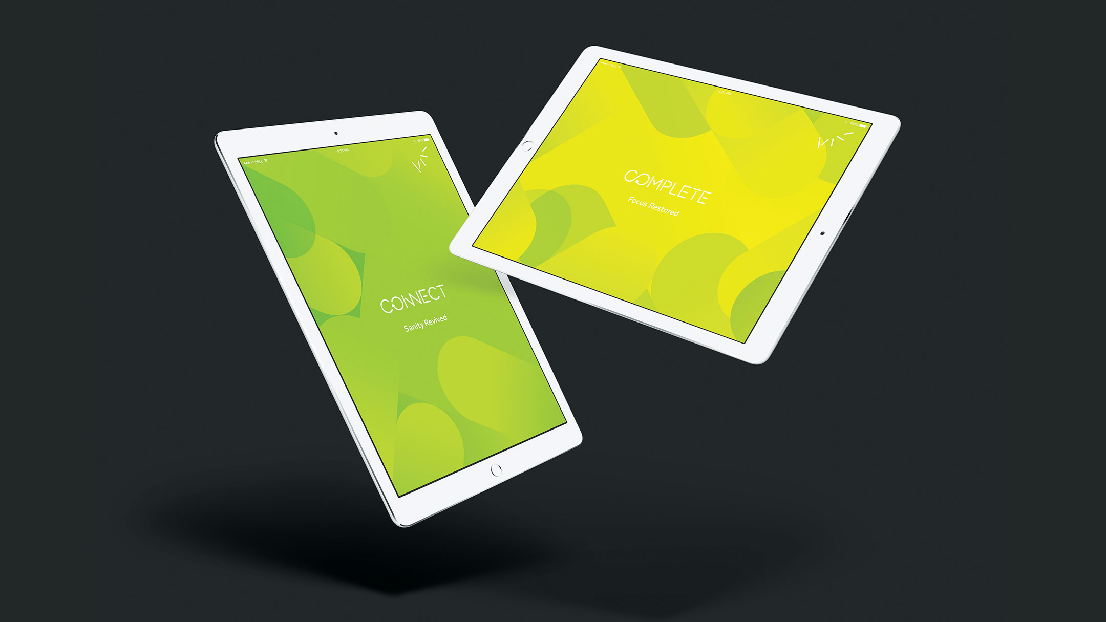
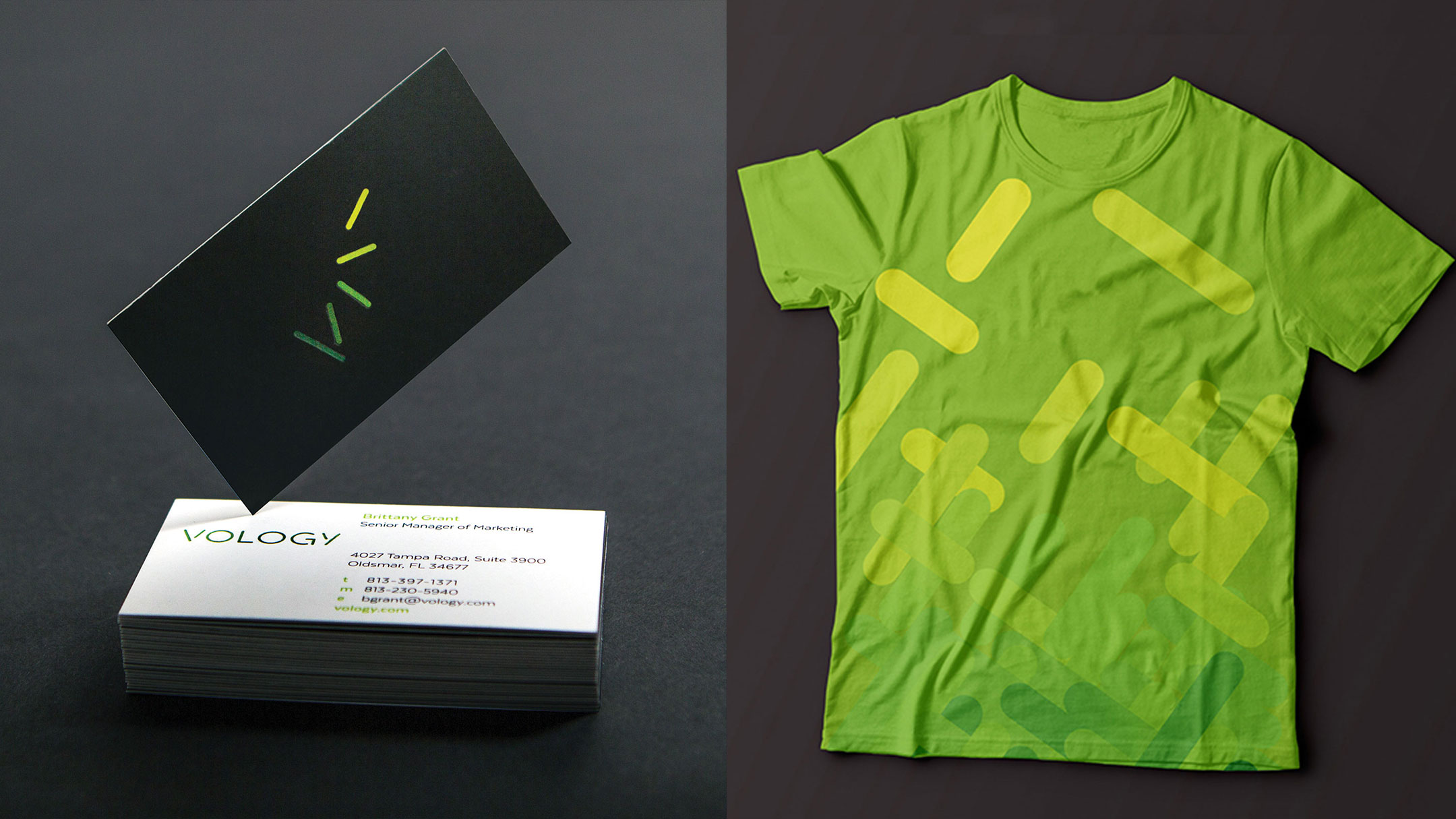
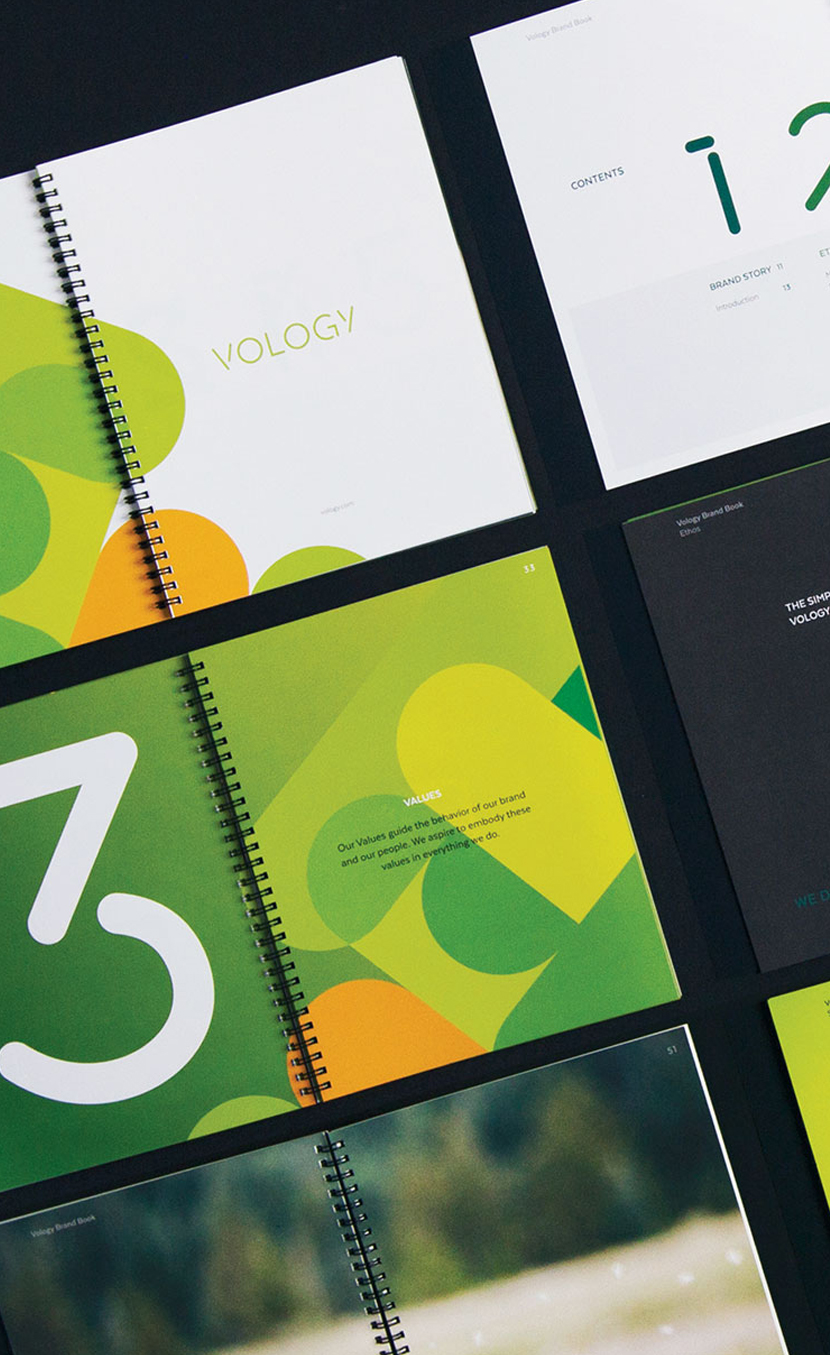
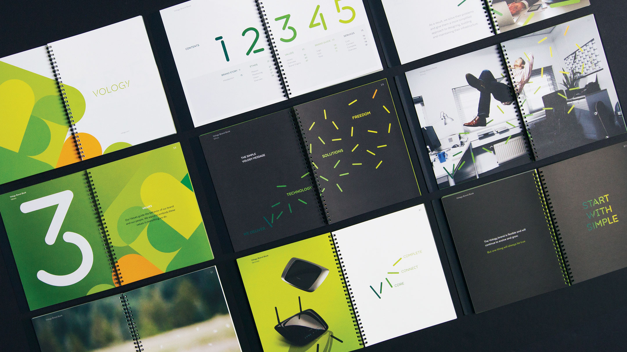
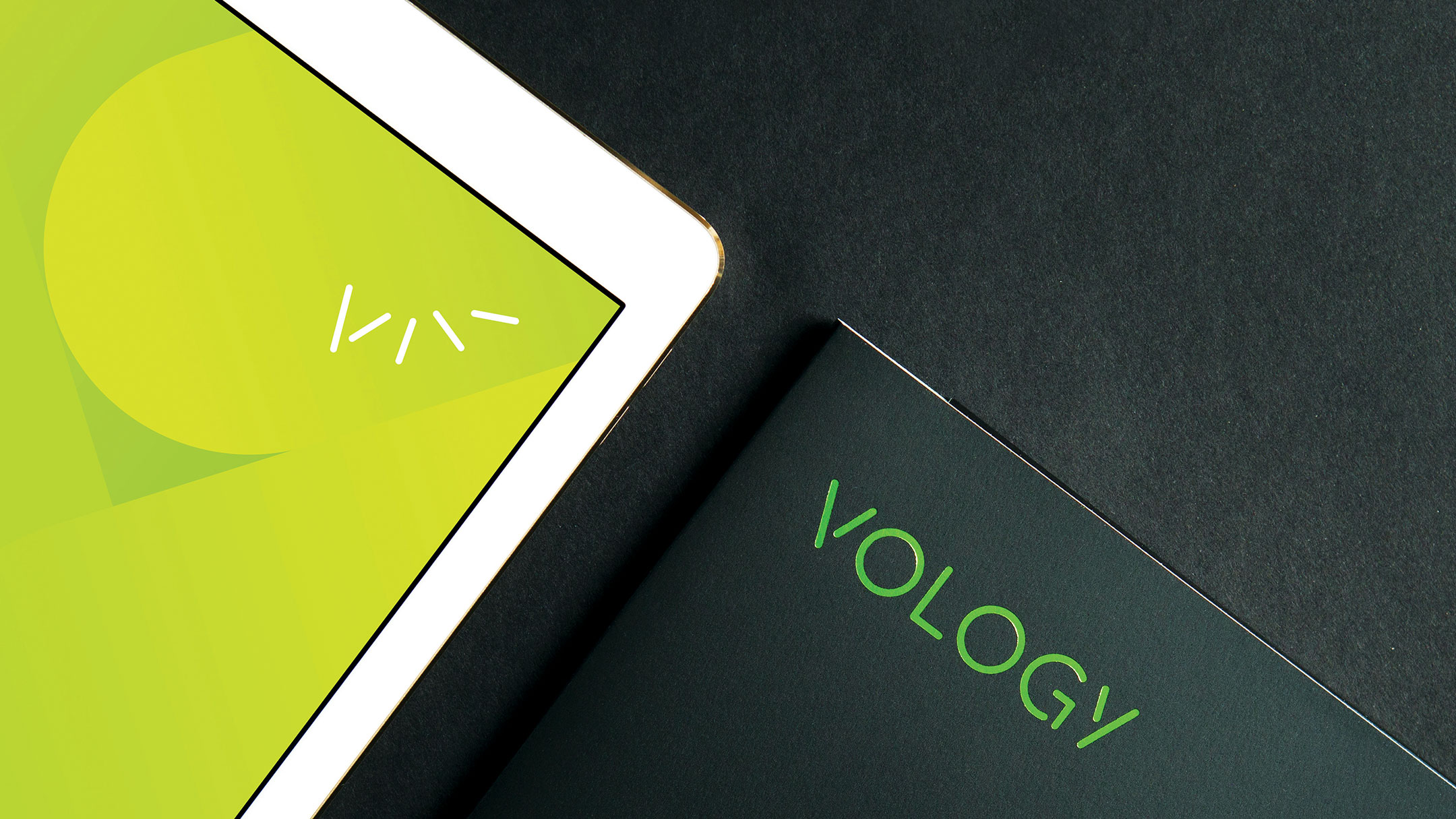
In contrast to every other jargon-heavy competitor, the brand was built on a simple foundation – freedom. The new logo represents breaking old barriers and embraces the simplicity Vology offers their clients.
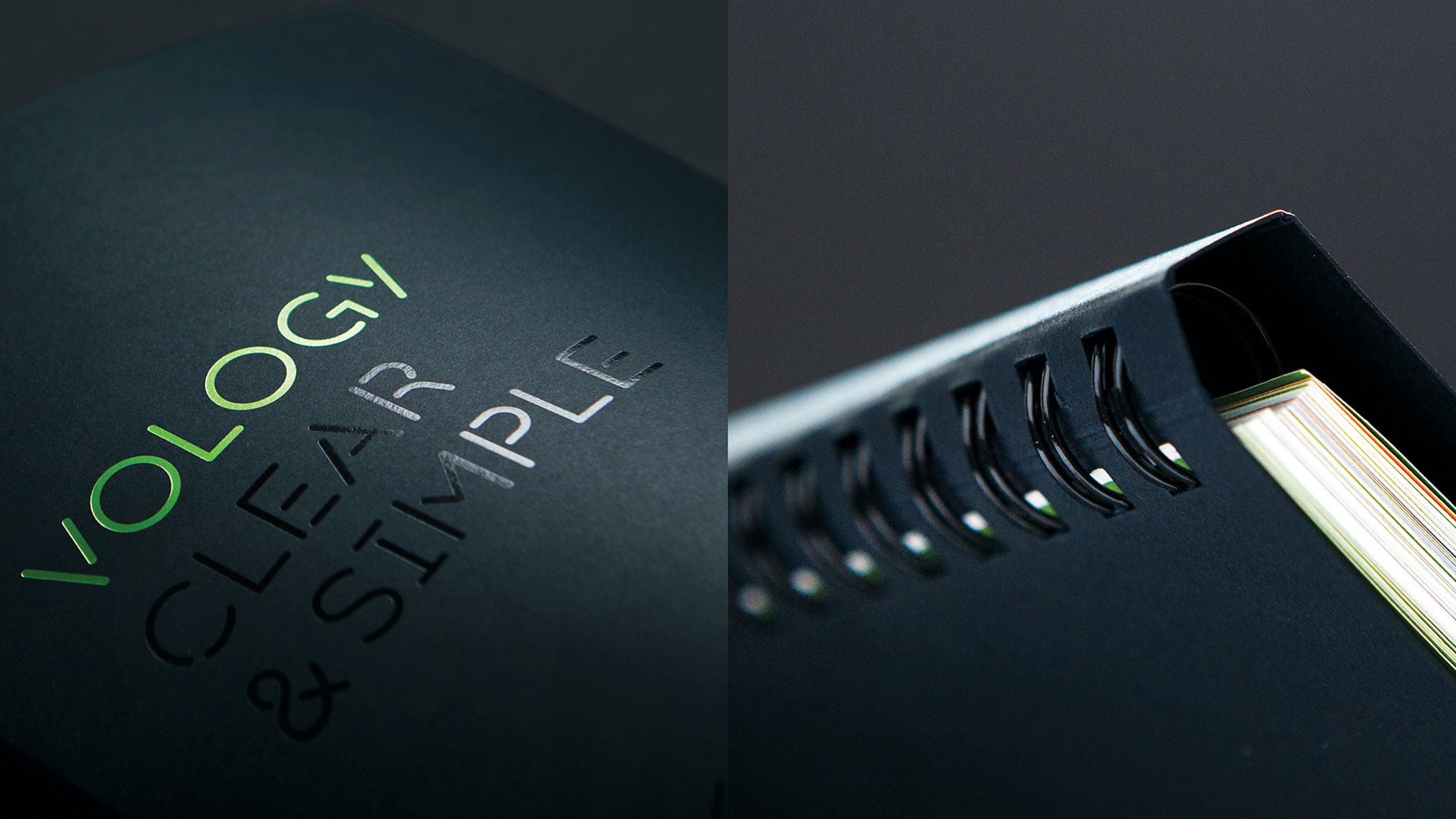
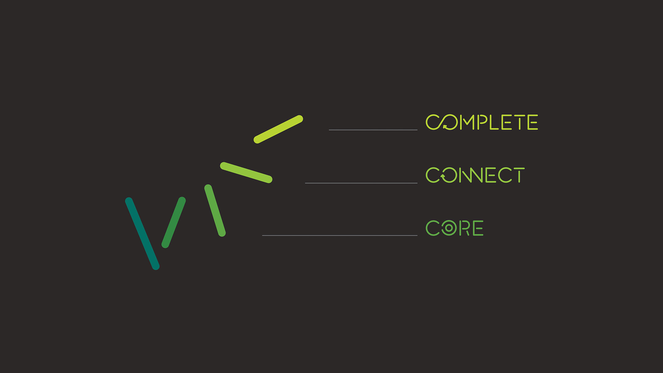
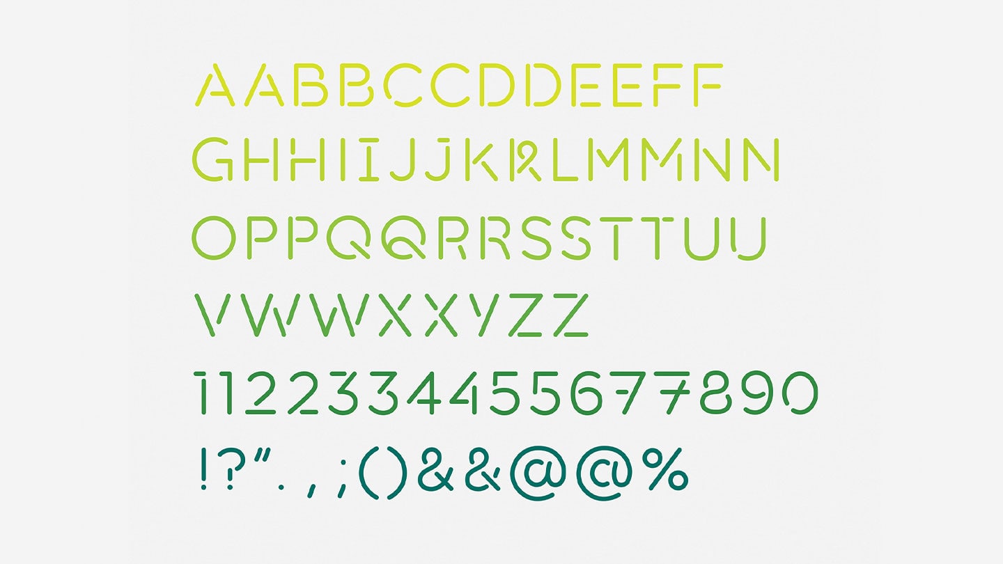
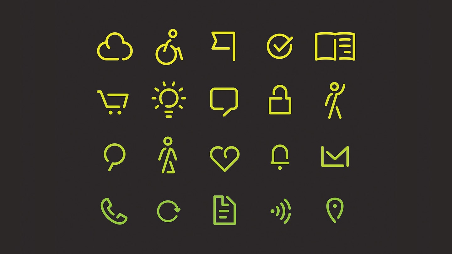
The sticks form the basis of the whole brand with every aspect of design including a custom typeface and animated icons coming from these liberated elements. An expanded color palette added to the sense of possibilities.
Information became education—a better understanding by both employees and customers through smarter IT marketing.