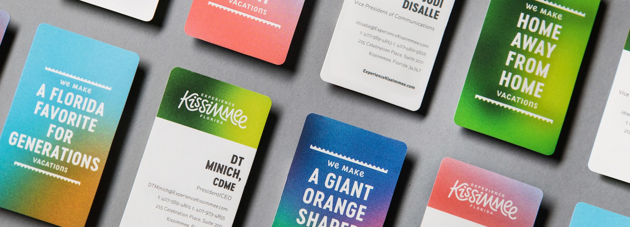
Kissimmee: Home to some of the biggest names in thrills and family fun. The problem? Orlando consistently stole its thunder and many people couldn’t tell them apart. This central Florida hub needed a rebrand and unique destination marketing system that could position them as more than just Orlando’s gateway, but as what they’ve been since 1971—the place where vacations are made.
After surveying 1,500+ people from around the world, 4 misconceptions rose to the top: Kissimmee appeared less exciting than Orlando, was a part of Orlando, catered only to older audiences, and didn’t offer anything besides theme parks.

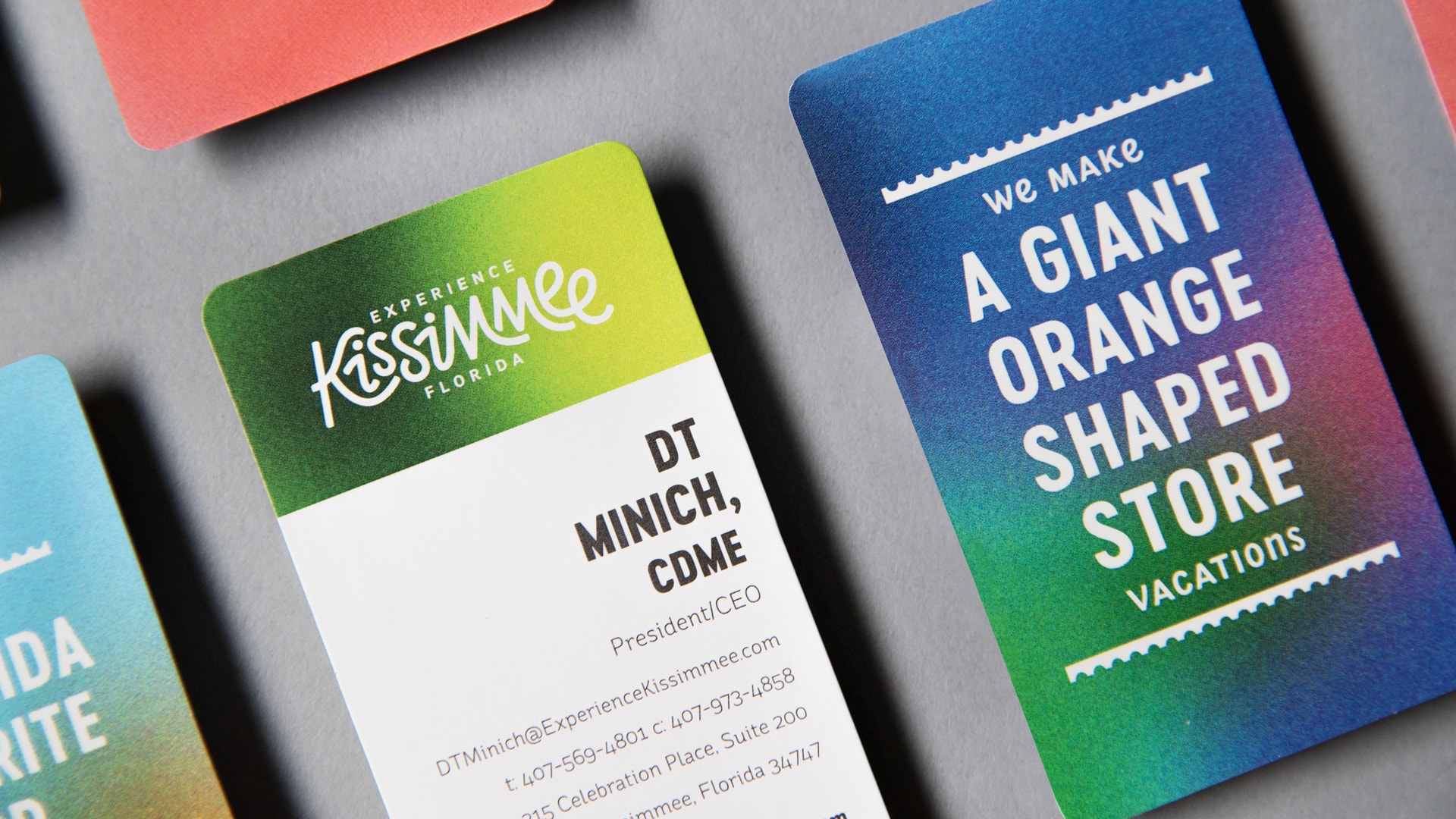
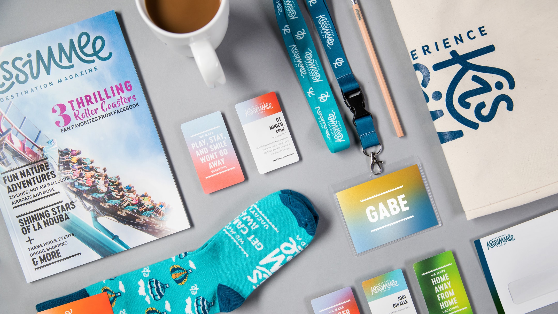
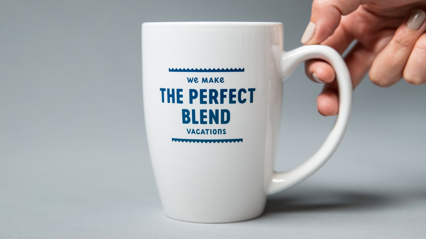
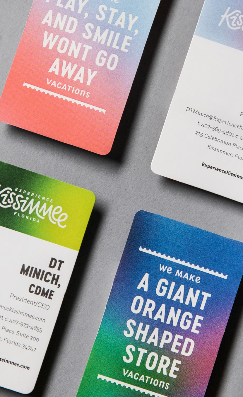
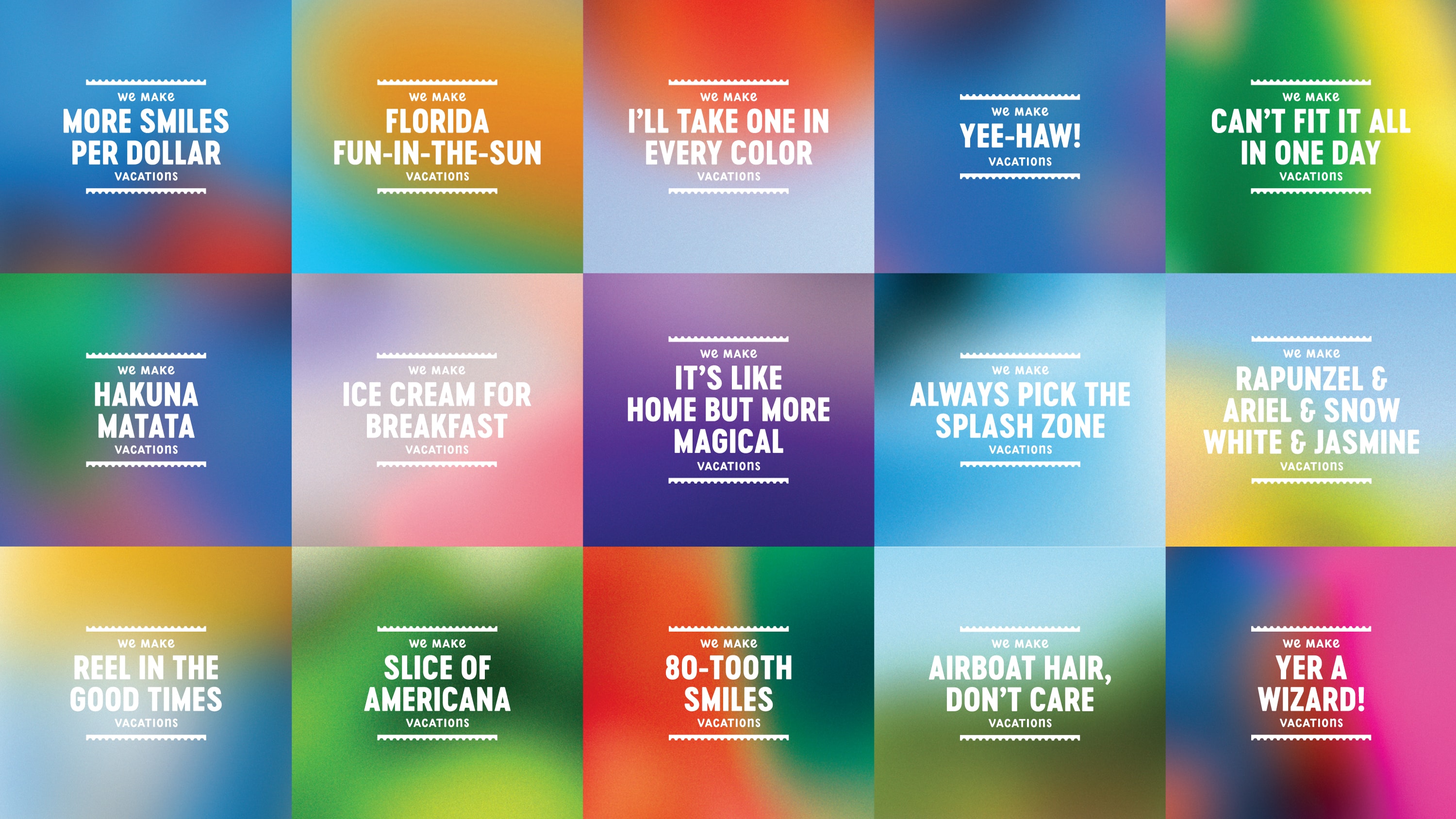
With a goal to keep the destination’s offerings front and center, the new brand promise of “We Make Vacations” conveyed Kissimmee’s long-standing role in the vacation industry quickly became a destination marketing device that literally expands to tell people just how many ways it’s what they do.
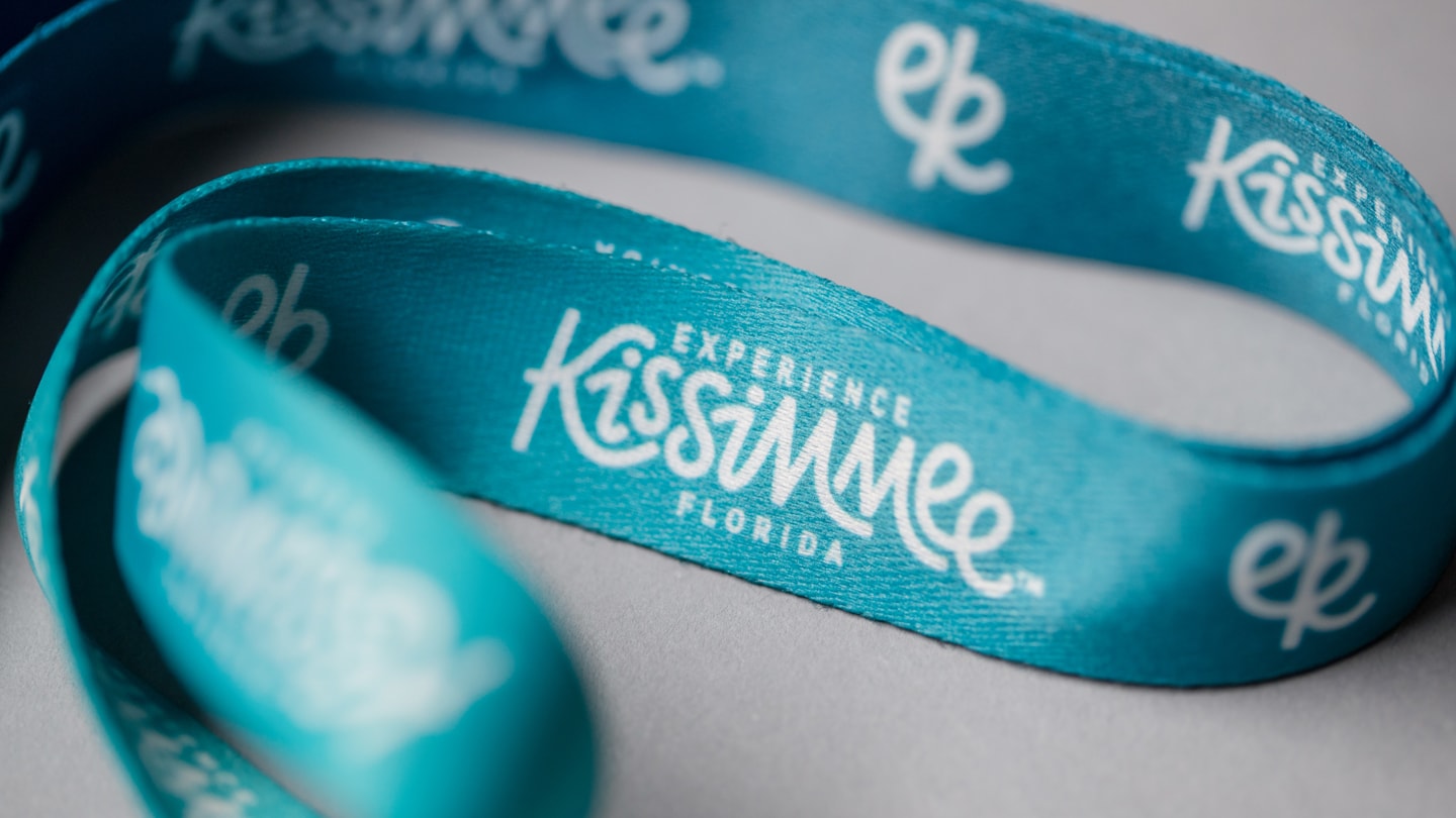
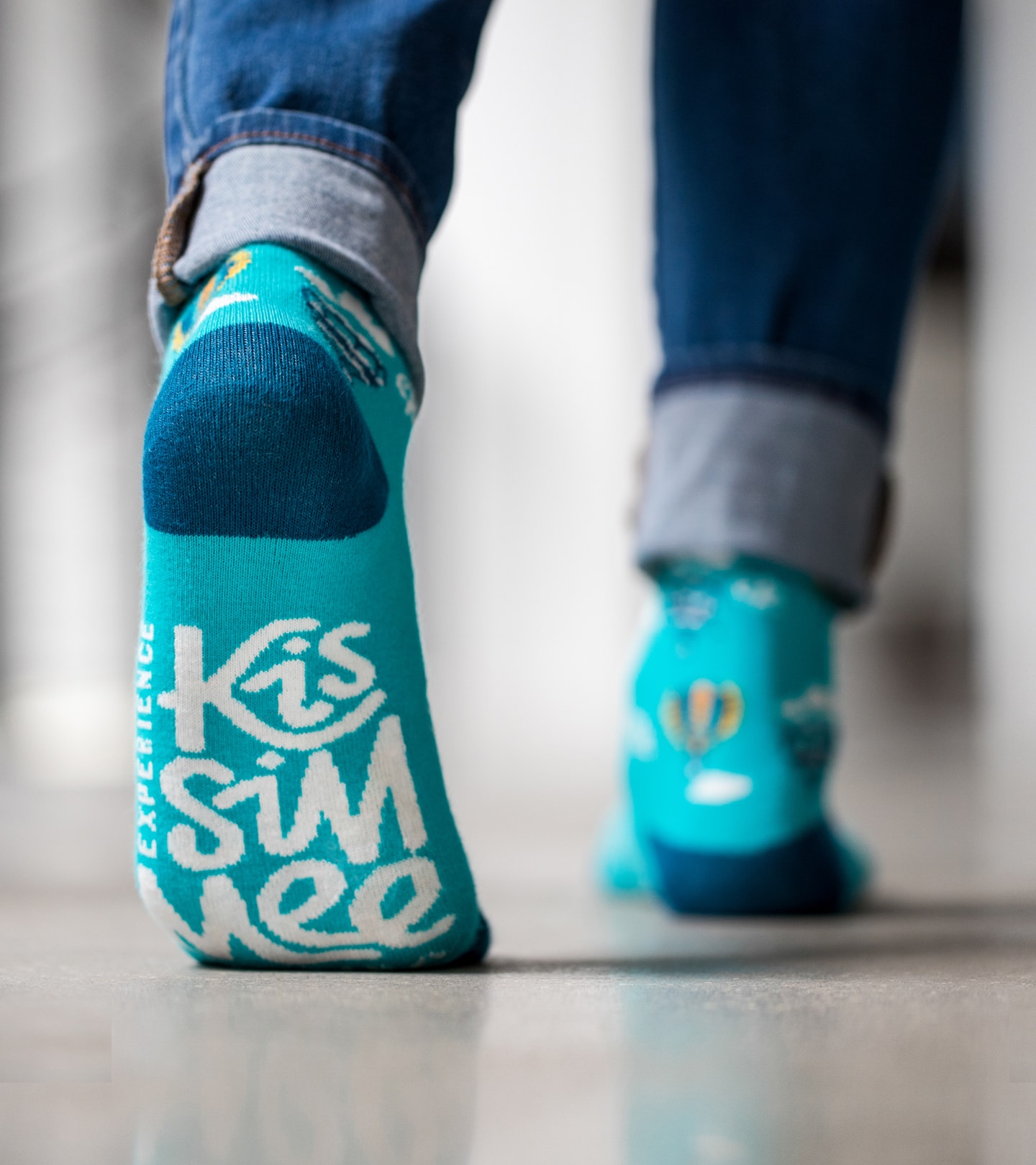
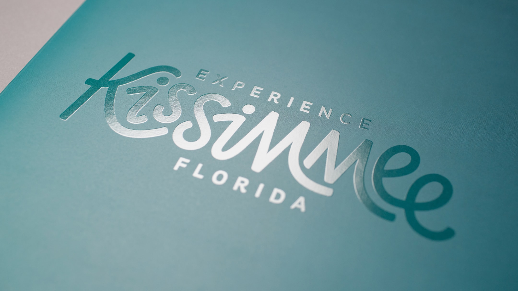
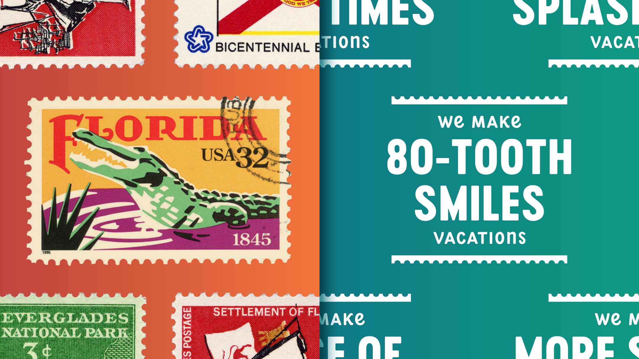
In addition to a more playful take on the destination’s previous logo design, vintage postcard stamps provided a timeless inspiration for the rebrand’s identity system.
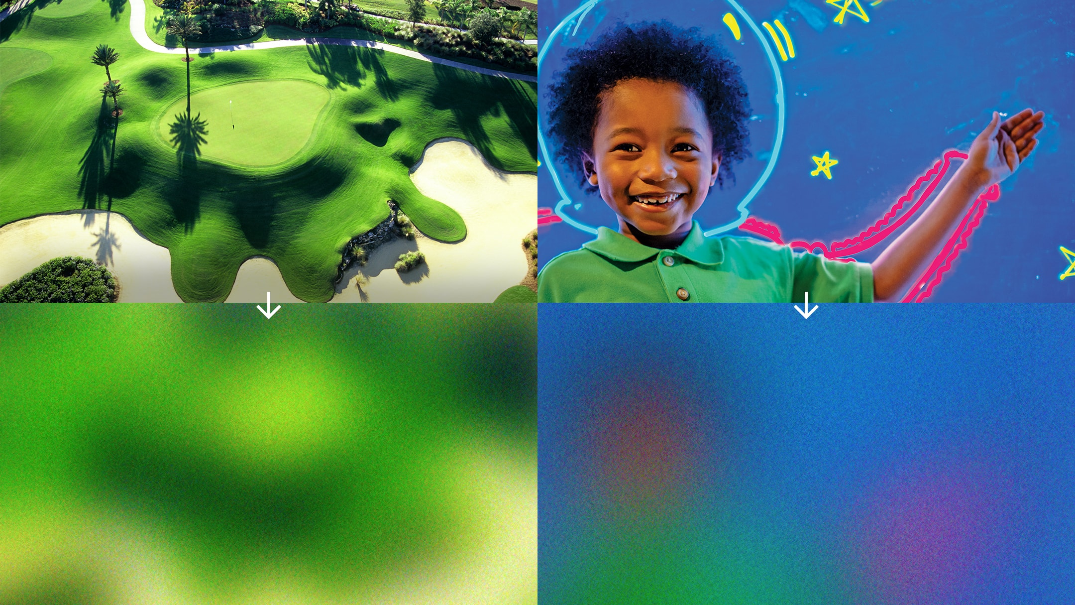
Real moments guided both the destination marketing photography and color palette.
