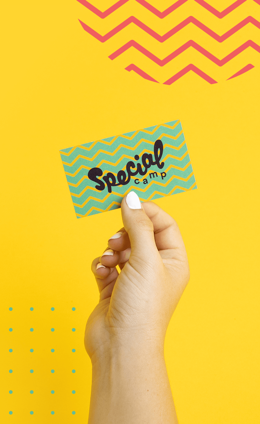

Often times, branding is the last thing a nonprofit is thinking about. A perfect example? Special Camp for Special Kids in California—a week-long summer camp dedicated to giving young adults of all abilities a chance to have the best summers of their lives. Without the resources (or time) to create branding as heart-warming or fun as their mission, they couldn’t communicate their expertise, enthusiasm, or commitment to campers, their parents, volunteers, and larger donors.
As our STOKED 2017 recipient, we gave them a free, nonprofit rebrand that was as bright and fun as their summers.
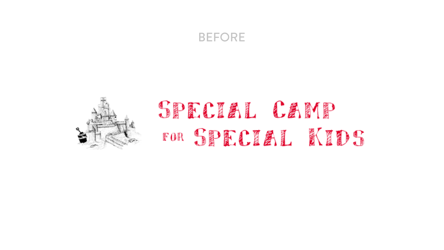
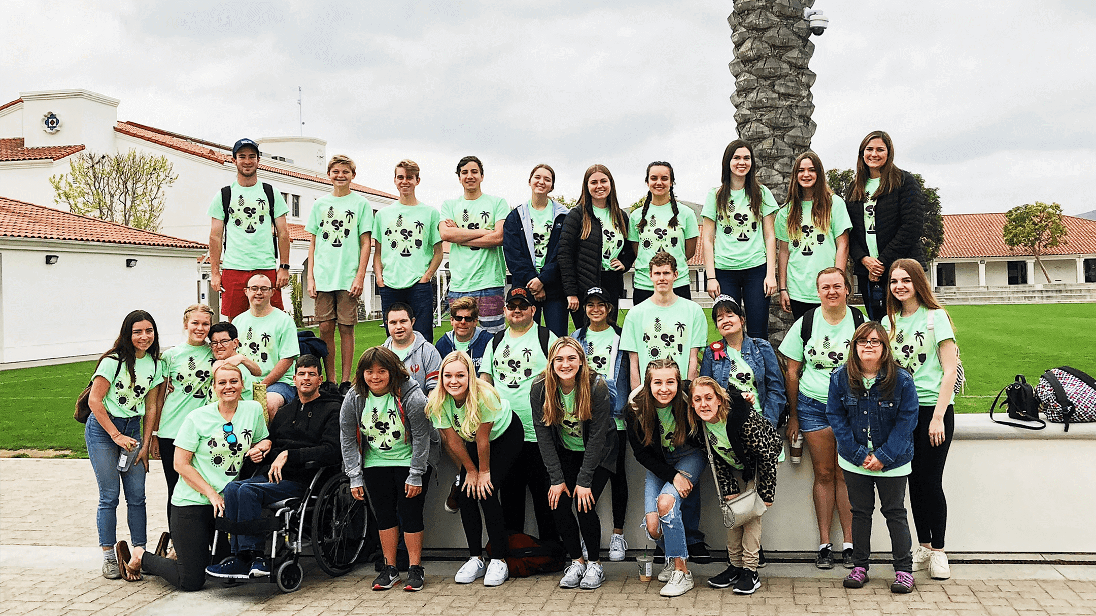
We began with an audit of the existing collateral, finding the pieces they were most proud of and learning about what they do and why they do it. The biggest find? Their unique 1:1 ratio between campers and counselors. With more specialized attention, a wider range of abilities can be cared for.
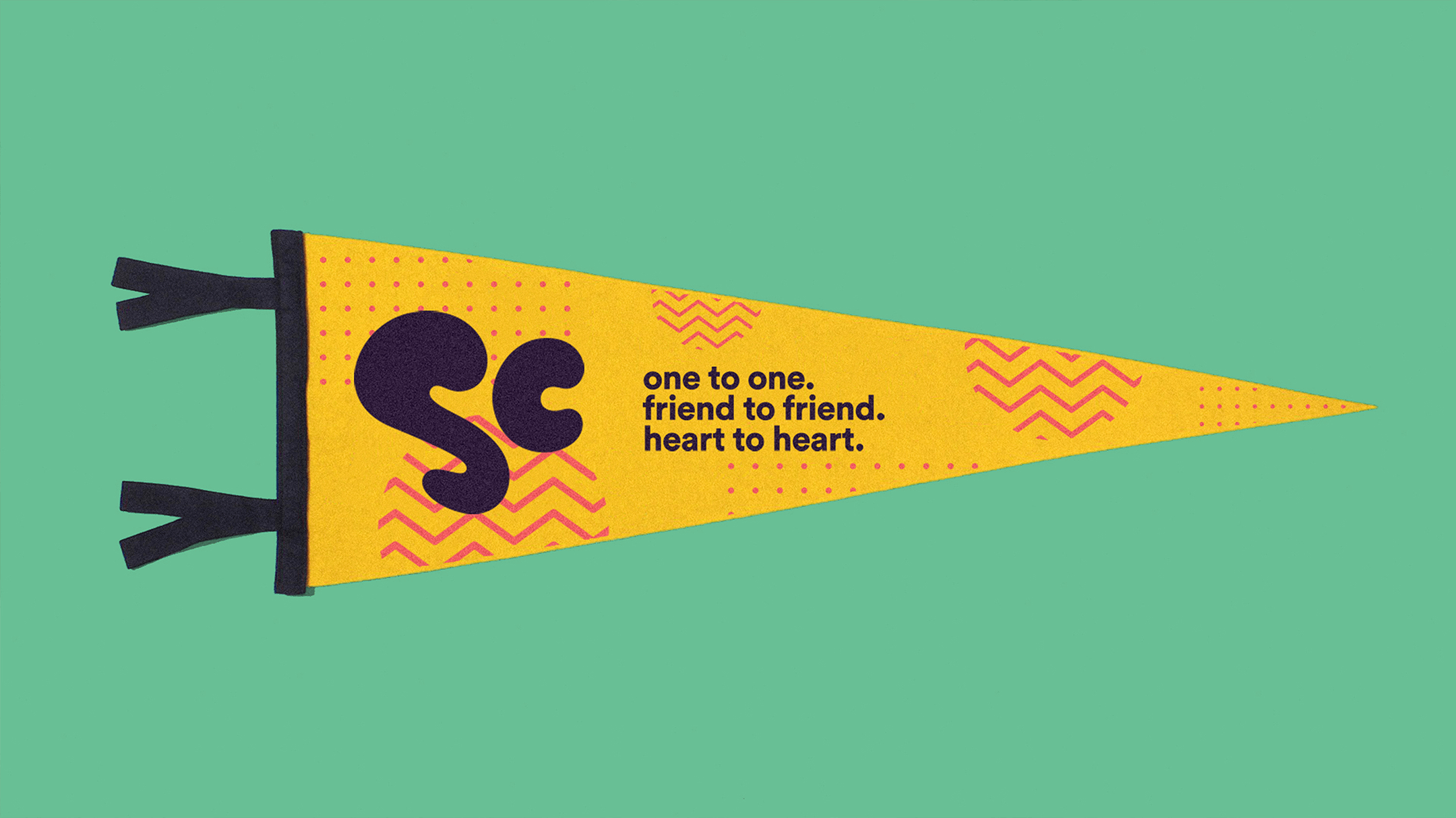
Our work began by redefining their story around that 1:1 selling point—they are “One to One. Friend to Friend. Heart to Heart.” From there, we shaped the new branding to highlight love, fun, and vibrancy in a way that feels modern and sophisticated.
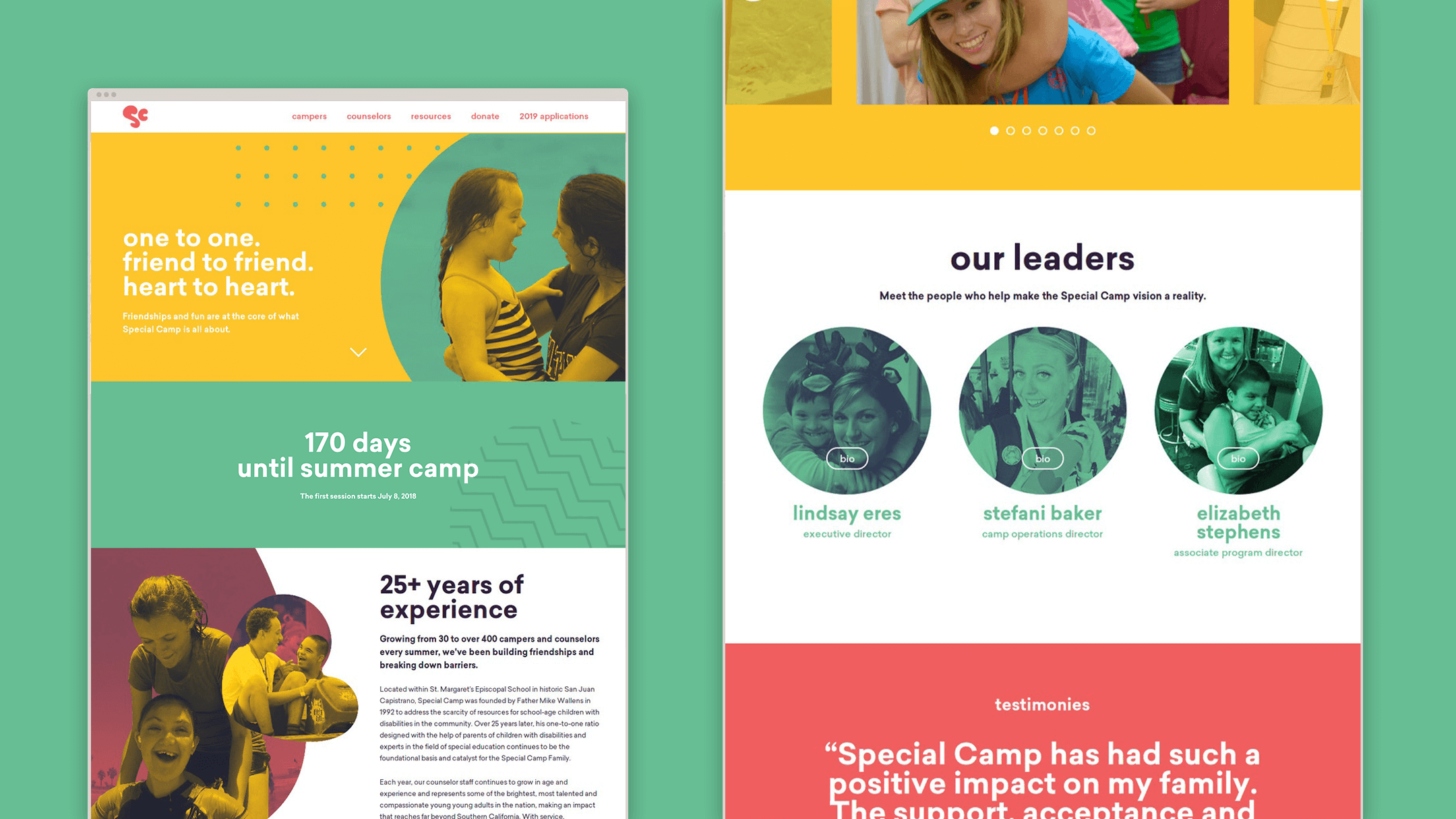
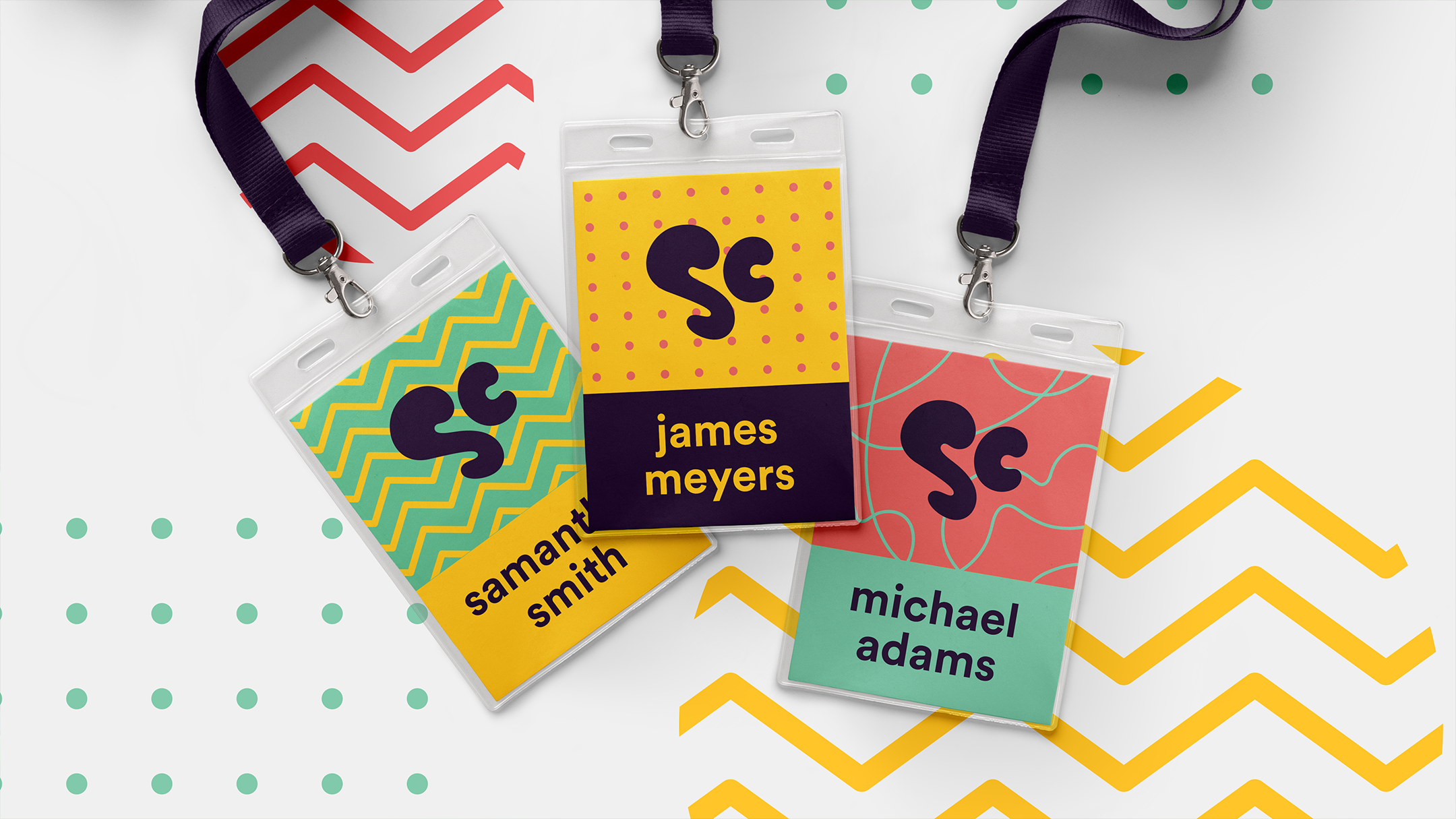
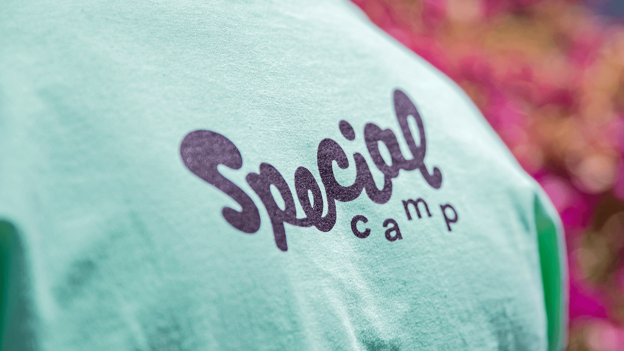
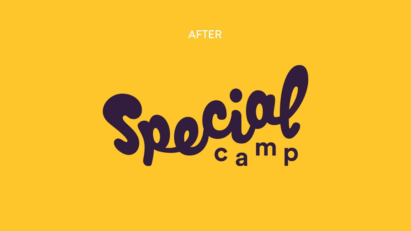
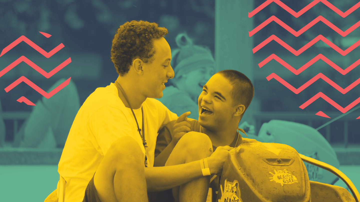
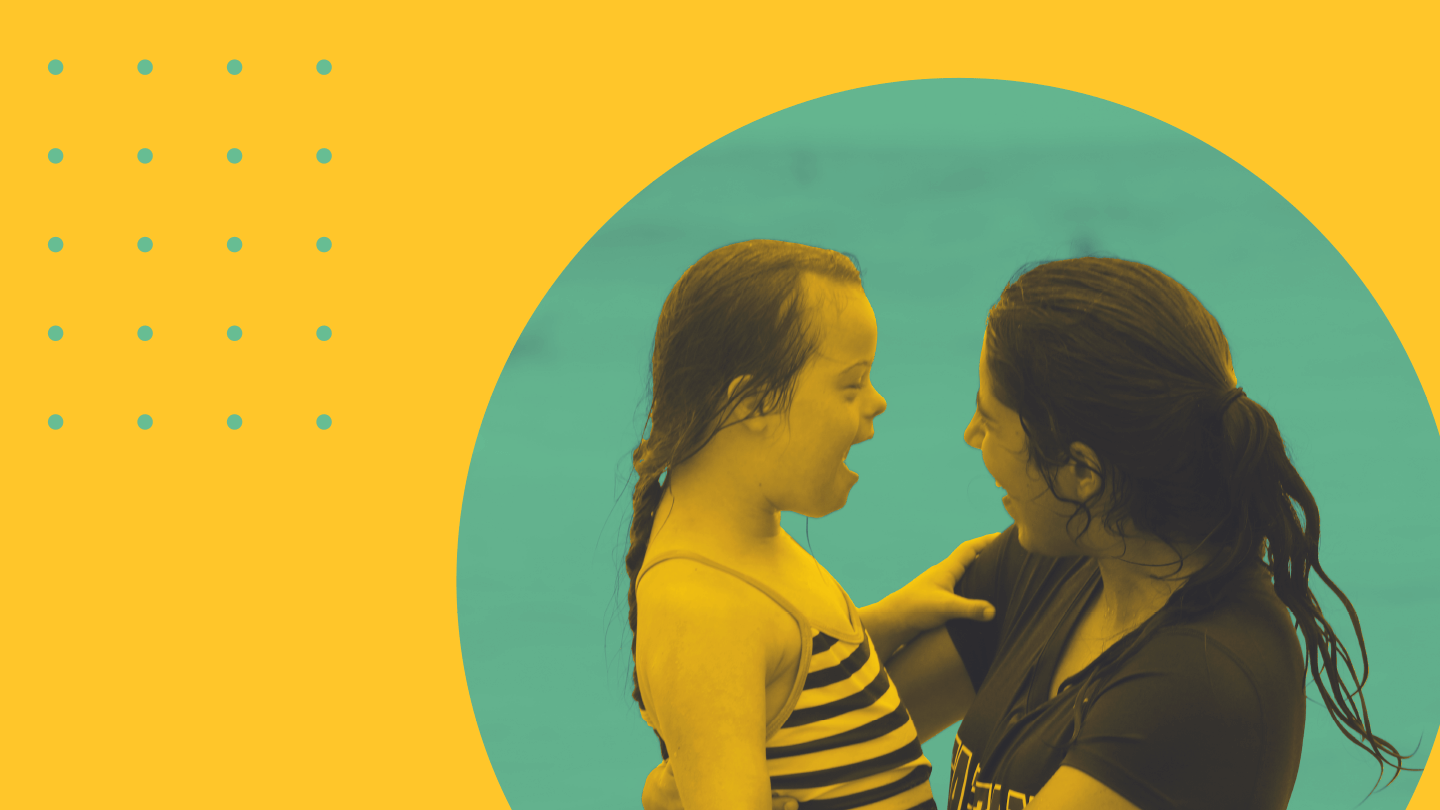
The new logo’s S and C come together to create the brand’s icon—a heart. In addition, easy-to-use patterns gives each application a different personality and a simple illustration style lets camp leaders refresh the theme every year, something critical for any nonprofit.
-Lindsay Eres and Stefani Baker, Special Camp Executive Director and Camp Operations Director
