

Building a Brand for Where You’re Going
There’s a big difference between refreshing a brand and building one for growth.
When the United Soccer League came to SPARK, the organization was already changing quickly. With deep roots in over 200 communities, an interconnected system of leagues, and ambitious plans for the future of American soccer, USL had become much bigger than many people realized.
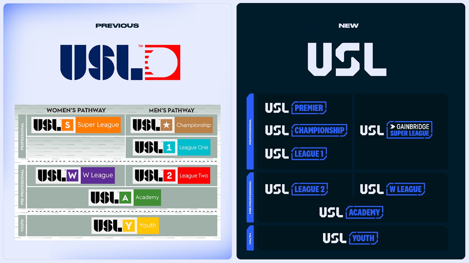
Its plans to grow the game and introduce promotion and relegation would ask even more of the brand. The identity needed to help people see the full organization and understand its role in the future of American soccer.
“Our mindset wasn’t, ‘How do we create an evolution of their existing logo?’” says SPARK ACD Matt Bongiolatti. “It was, ‘How do we create a foundational system that allows them to grow the game?’”
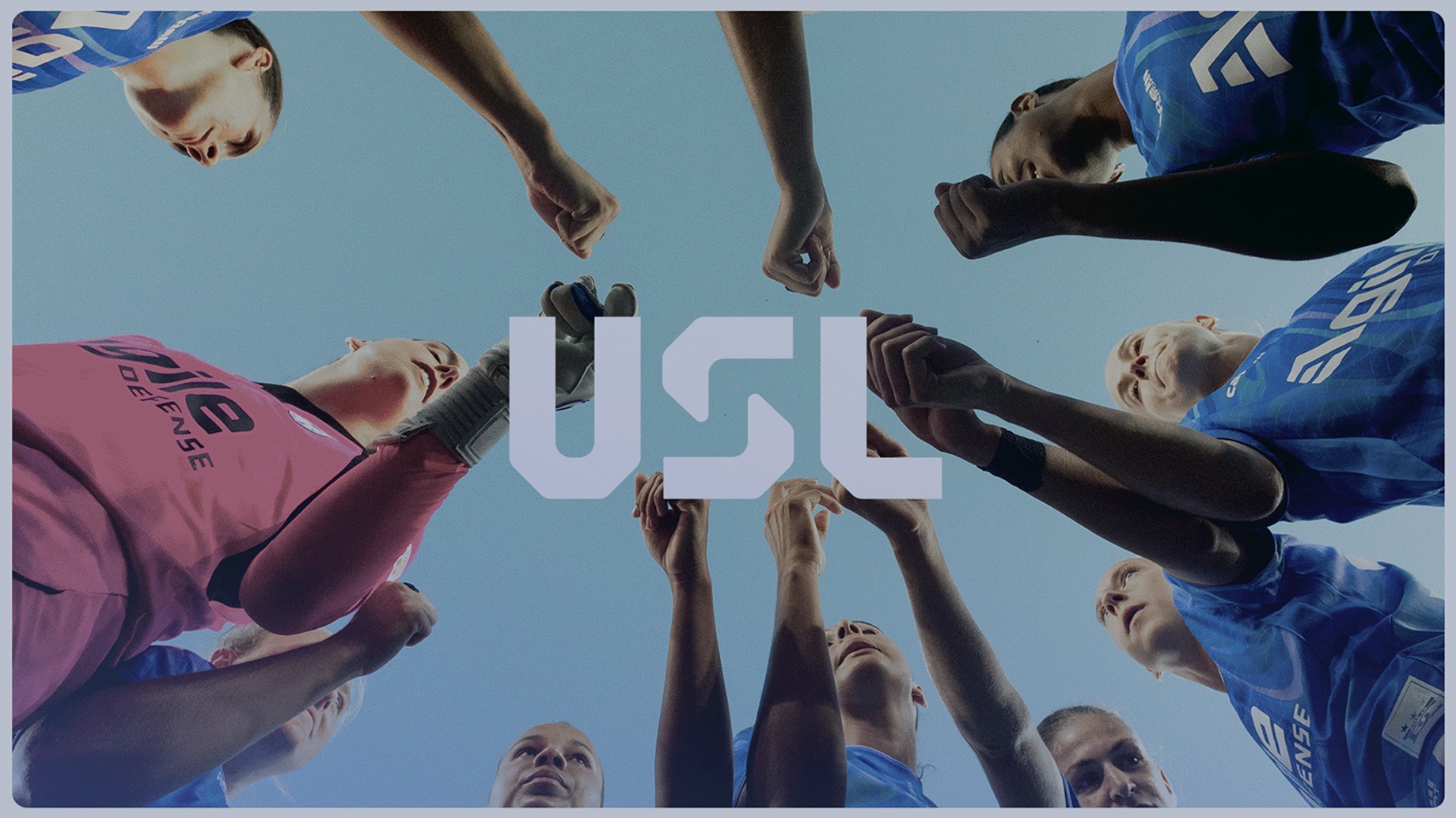
Finding the Right Place in Soccer
Soccer offered plenty of familiar starting points. The harder question was which of them belonged to USL.
“We knew we had to break from typical conventions and think deeper about what the USL is, what it means to the fans, and what unique visual cues we could use to stand out,” says Aiham Kara Hawa, SPARK Associate Design Director. “We needed to tap into the soccer lifestyle.”
Fans’ strongest attachments are often to their local clubs. Those clubs already have their own colors, traditions, and identities, many built around a crest. Giving USL another crest risked adding to the visual clutter. It also became complicated when we considered how that approach would extend across USL’s different leagues.
“Soccer is for the fans,” Kara Hawa says. “We had to design a brand that could stand out without overwhelming local clubs’ identities.”
We began looking more closely at brand architecture: how a family of related brands can work together and remain recognizable. USL needed a system that could organize its leagues and make their relationships clearer. Treating it as a single sports league with a single badge wasn’t going to solve that problem.
Looking Beyond Our Own Perspective
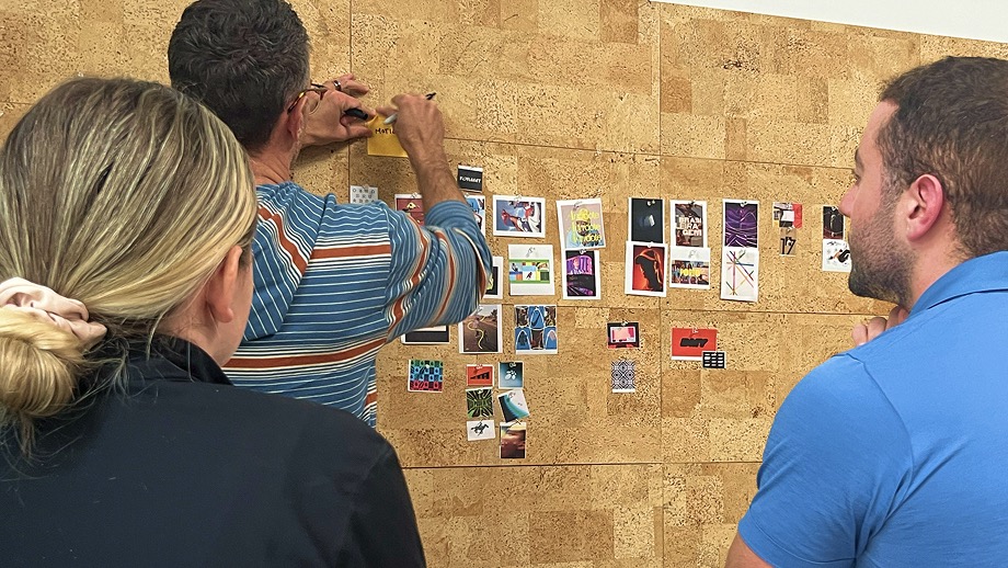
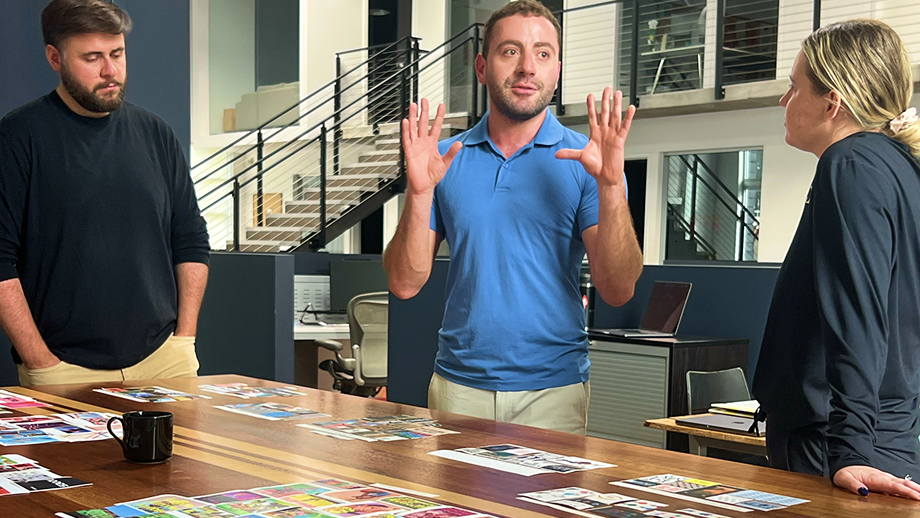
Through Worldwide Partners, Inc. (WPI), SPARK brought international agency leaders and soccer fans into the process to review early thinking and developing identity directions. They helped us see where our own enthusiasm might be getting ahead of the brief.
“The outside perspective was critical to help us challenge our own bias,” says SPARK VP of Creative Elliott Bedinghaus. “Their expertise helped us see that some explorations could feel dated in a few years, alienate important audiences, or create production challenges.”
One of our favorite directions was energetic and trendy. Its fashionable qualities were part of its appeal, but they also put a shorter shelf life on it. Replacing an identity across a network this complex would mean revisiting far more than the logo. Longevity became a more demanding test for the work.
Other explorations exposed different limits. One felt too sophisticated, almost European. The more youthful direction risked speaking too narrowly to a younger audience. Another asked viewers to bring too much soccer knowledge with them.
USL needed to welcome people still learning the sport while earning the respect of committed fans. We had to find a visual language broad enough for both without sanding away everything that made it distinctive.

A Closer Look at the S
“Early on, I remember we were sketching soccer balls and historic iconography and none of it ever felt right,” Kara Hawa says. “We had to leave that behind and create what’s next for the United Soccer League”
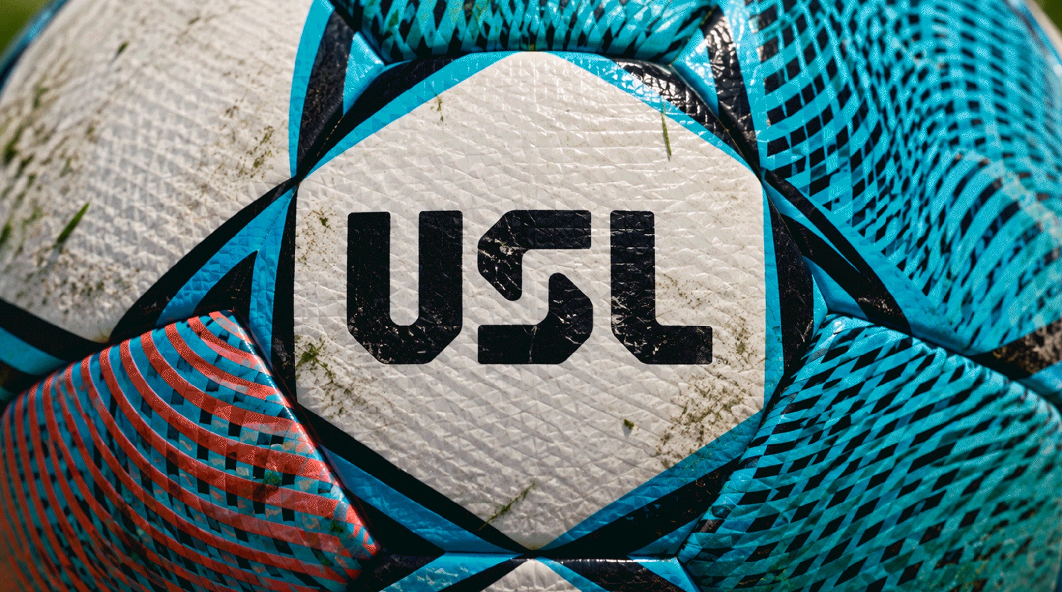
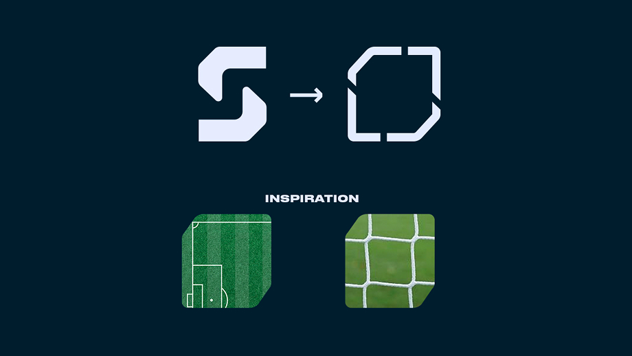
That exploration contributed to the work with soccer-ball hexagons becoming visual inspirations, but the decisive departure was from the typical badge or crest as the organizing visual for the identity.
The finished mark carries a more specific reference to USL’s future. Look inside the negative space of the S and you’ll find a stair step. It alludes to upward and downward movement within a promotion and relegation system, and to the players, teams, and communities moving through it.
The step also gives the wider identity something useful to work with. Extracted from the mark, it becomes a supporting brand element that can announce movement and changes within the leagues. A detail in the logo can help tell an ongoing story as teams move between levels.
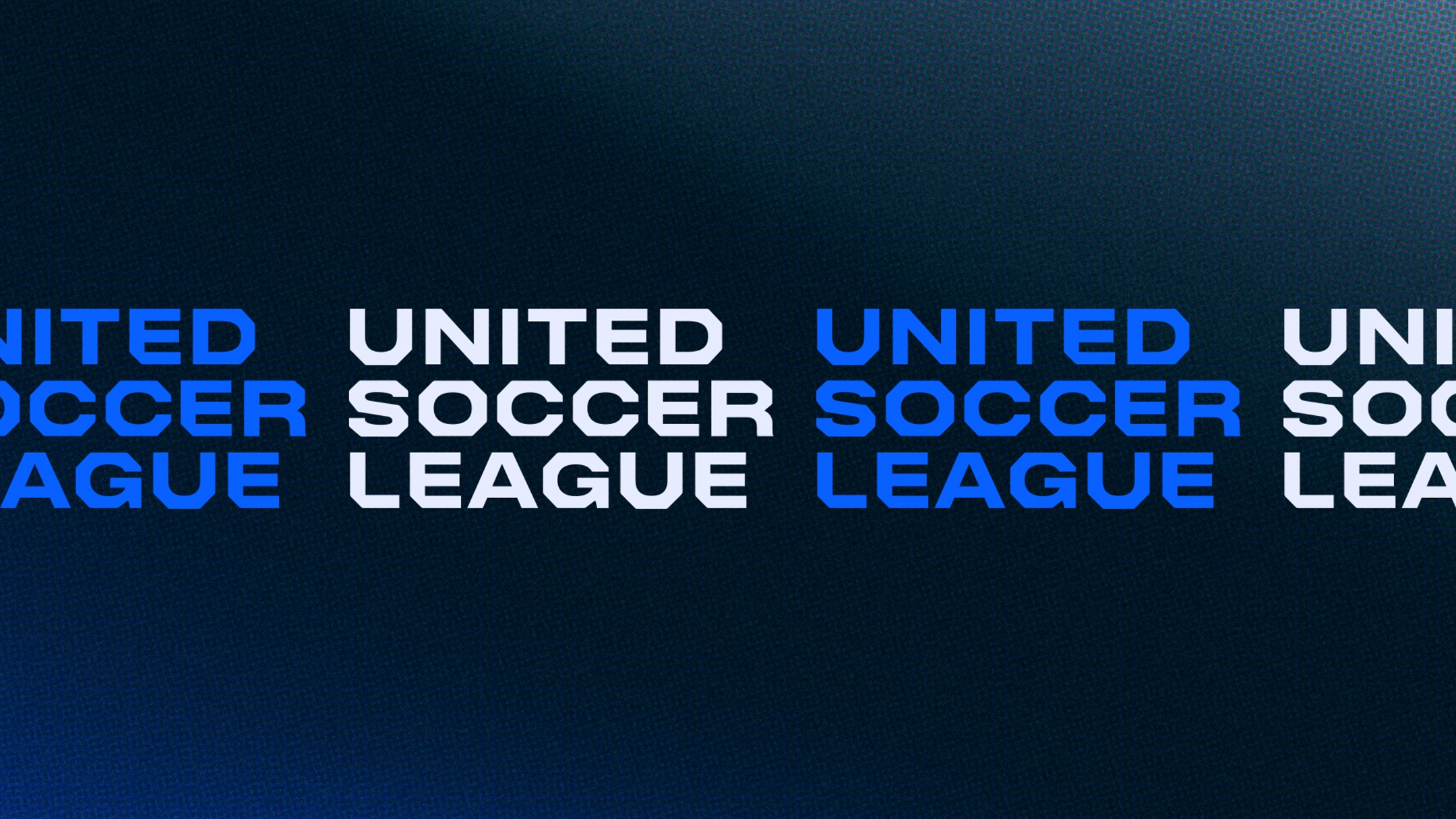
Alongside the mark sits United For Soccer.
“The tagline does a lot of work to introduce the name, category, and purpose all in one,” Bedinghaus says. “USL is bringing fans, communities, teams, and ecosystems of leagues together for the advancement of the sport.”
Room For The Clubs
“The brand balances the strength of the overall USL organization with the individuality of its clubs and communities,” Bongiolatti says. “We learned that USL’s value comes from the way its leagues, teams, and pathways work together, so the finished system needed to feel unified.”
That balance is the practical test of the identity. Fans should be able to recognize USL and understand the connections between its leagues, while their club’s identity keeps its own place.
The result gives USL a common visual language for a complicated organization. There’s room for its clubs, a way to communicate movement, and a mark designed to last beyond the trends that first caught our eye.